Description
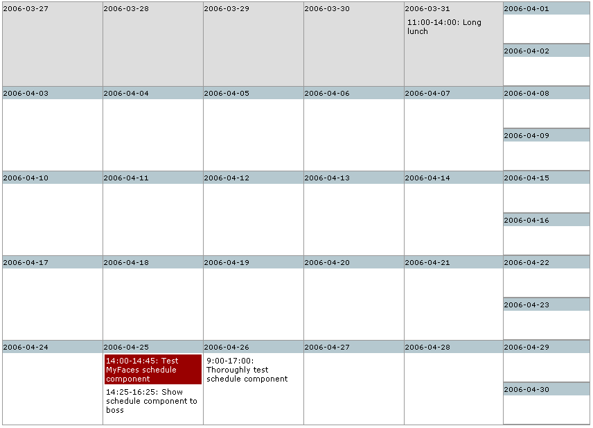
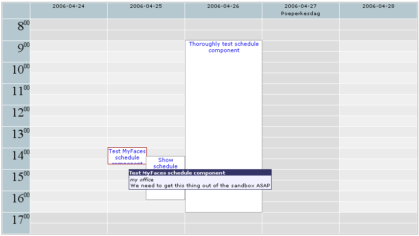
Renders a schedule component, showing appointments and events in a day, workweek, week or month view, similar to the schedule part of MS Outlook or Evolution.
The component is backed by an implementation of the ScheduleModel interface. Creating a custom model can be easily achieved by implementing this interface, or by overriding the AbstractScheduleModel class.
API
| author | Jurgen Lust |
| component-family | javax.faces.Panel |
| renderer-type | org.apache.myfaces.Schedule |
| component-class | org.apache.myfaces.custom.schedule.HtmlSchedule |
| renderer-class | org.apache.myfaces.custom.schedule.renderer.ScheduleDelegatingRenderer |
| tag-class | org.apache.myfaces.custom.schedule.ScheduleTag |
Usage
<s:schedule [ UI component attributes ]
               [ UI command attributes ]
               [value="#{backingBean.scheduleModel}"]
               [visibleStartHour="7"]
               [visibleEndHour="21"]
               [workingStartHour="9"]
               [workingEndHour="17"]
               [readonly={true|false}]
               [submitOnClick={true|false}]
               [mouseListener="#{backingBean.scheduleClicked}"]
               [tooltip={true|false}]
               [theme={default|outlookxp|evolution}]
               [headerDateFormat="dd-MM-yyyy"]
               [compactWeekRowHeight="200"]
               [compactMonthRowHeight="100"]>
</s:schedule>
Syntax
value - This must be a value binding expression that points to an instance of ScheduleModel.
visibleStartHour - Integer value indicating the first hour of the day that should be visible in the schedule
visibleEndHour - Integer value indicating the last hour of the day that should be visible in the schedule
workingStartHour - Integer value indicating the start of the working day. Everything before this hour will be grayed out
workingEndHour - Integer value indicating the end of the working day. Everything after this hour will be grayed out
readonly - When a schedule is read-only, no entries can be selected
submitOnClick - When this is true AND the readonly property is set to false, then clicking anywhere on the schedule, but outside an entry box, will submit the form, posting the date and the time of day that was clicked.
mouseListener - a Method Binding with parameter of type ScheduleMouseEvent. This allows a backing bean to listen for mouse click events on the schedule.
tooltip - Determines whether or not tooltips will be displayed for schedule entries
renderZeroLengthEntries - Normally, when an entry has the same start- and endtime, it is not rendered in the detailed views. Setting this to 'true' forces such entries to be rendered. The size of the entry box is then adapted to fit the text in it.
expandToFitEntries - By default, if an appointment exists outside the visibleStartHour/visibleEndHour limits, it does not appear in the day or workweek modes. This setting checks for events outside the visible range and extends the visible range to display the events. If events only occur within the visible range, then no adjustment is made.
theme - The name of the theme that should be used when rendering the schedule. Available themes are 'default', 'outlookxp' and 'evolution'
headerDateFormat - If you want to override the Locale dateFormat for displaying the date in the header, you can specify the custom format here
compactWeekRowHeight - The height in pixels of a row in the week view (defaults to 200)
compactMonthRowHeight - The height in pixels of a row in the month view (defaults to 100)
entryRenderer - value binding to an instance of ScheduleEntryRenderer that is used to render entries on the schedule. (default: DefaultScheduleEntryRenderer)
columnClass - css class for columns in the detailed mode (default: column)
backgroundClass - css class for the background of the detailed mode (default: background)
freeClass - css class for non-working hours in the detailed mode (default: free)
evenClass - css class for even rows in the detailed mode (default: even)
unevenClass - css class for uneven rows in the detailed mode (default: uneven)
gutterClass - the css class of a td in the gutter on the left, containing hours of the day (default: gutter)
headerClass - the css class of a td in the header, containing dates (default: header)
dateClass - the css class of the span around the date in the header (default: date)
holidayClass - the css class of the span around a holiday name in the header (default: holiday)
hoursClass - the css class of the span around the hour in the gutter (default: hours)
minutesClass - the css class of the span around the minutes in the gutter (default: minutes)
selectedEntryClass - the css class of the div around a selected entry (default: entry-selected)
textClass - the css class of the div around the contents of an entry in the detailed mode, when using the DefaultScheduleEntryRenderer (default: text)
titleClass - the css class of the span around the title of an entry in the detailed mode, when using the DefaultScheduleEntryRenderer (default: title)
subtitleClass - the css class of the span around the subtitle of an entry in the detailed mode, when using the DefaultScheduleRenderer (default: subtitle)
entryClass - the css class of the div around an entry (default: entry)
foregroundClass - the css class of the div containing the foreground table (default: foreground)
dayClass - the css class of the td representing a day in the compact mode (default: day)
inactiveDayClass: the css class of the td representing an inactive day in the compact mode (default: inactive-day)
contentClass - the css class of the td containing the entries of a day in the compact mode (default: content)
selectedClass: the css class of a selected entry in the compact mode (default: selected)
monthClass - the css class of the table representing a month in the compact mode (default: month)
weekClass - the css class of the table representing a week in the compact mode (default: week)


