While this section provides an overview how Controls work please see the Javadoc. which provides extensive information and examples. Javadoc
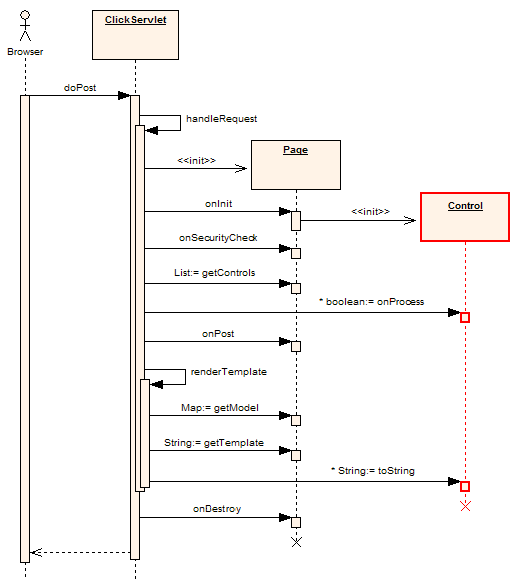
Figure 1. Post Sequence Diagram - created with Enterprise Architect courtesy Sparx Systems
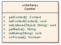
In Click all control classes must implement the Control interface. The Control interface is depicted below in Figure 2.
Figure 2. Control Interface Diagram - created with Enterprise Architect courtesy Sparx Systems
Methods on the Control interface include:public class SimpleCallback extends Page { /** * @see Page#onInit() */ public void onInit() { ActionLink clickLink = new ActionLink("clickLink"); clickLink.setListener(this, "onClick"); addControl(clickLink); } public boolean onClick() { System.out.println("onClick invoked"); return true; } }The listener method can have any name but it must have take no parameters and must return a boolean or java.lang.Boolean value. When a callback method returns true the processing of other Controls will continue and the Pages onGet() or onPost() event handler will be called. If a controls returns false not further Control processing will be performed and neither of the Page onGet() or onPost() methods will be invoked. This execution logic is illustrated in the Page Execution Activity Diagram. Being able to stop further processing and do something else can be very handy. For example your Pages onGet() or onPost() method may perform an expensive database operation. By using returning false in a event handler you can skip this step and forward to the next page.
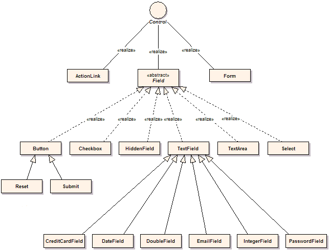
Figure 3. Package Class Diagram - created with Enterprise Architect courtesy Sparx Systems
The key control classes include:/click-control.propertiesTo customize the control properties simply add this file to your classpath and tailor the specific values.
# Click Control messages
calendar-image-title=Calendar
creditcard-number-error={0} is invalid
date-format-error={0} is invalid. Date format is {1}
double-format-error={0} must be a number value
email-format-error={0} is invalid, email format is user@hostname
errors-header=
errors-prefix=
errors-suffix=
errors-footer=
field-maxlength-error={0} must be no longer than {1} characers
field-minlength-error={0} must be at least {1} characters
field-required-error=You must enter a value for {0}
file-required-error=You must enter a filename for {0}
integer-format-error={0} must be a number value
label-required-prefix=
label-required-suffix=<font color="red">*</font>
not-checked-error=You must select {0}
number-maxvalue-error={0} must not be larger than {1}
number-minvalue-error={0} must not be smaller than {1}
select-error=You must select a value for {0}

# Message displayed when a error occurs when the application is in "production" mode
production-error-message=<div id='errorReport' class='errorReport'>
   The application encountered an unexpected error.</div>
The errors-header, errors-prefix, errors-suffix and errors-footer act like their
equivalent Struts values and will format form validation error messages in HTML list.
For example to render error messages as red list items:
errors-header=<ul>
errors-prefix=<li><font color="red">
errors-suffix=</font></li>
errors-footer=</ul>
The Field class provides a number of methods for gettting localized strings and formatting messages: