

Apache Trinidad Skinning
- About Skinning
- Create a skin - an overview
- How to create a skin
- Skinning a component - a step-by-step example
- Skinning Keys
- Skinning Text
- Skinning CSS features
- Package your Skin in a JAR file
- Tips and Tricks
- Skinning for Custom Component Developers
- Pre-generating Skin Style Sheets
- Advanced Skinning Features
- Frequently Asked Questions
About Skinning
A skin in Trinidad is a global style sheet that affects the entire application. You can create one skin for the entire application and as long as you have the <tr:document> tag on your page it will get picked up. Every component will automatically use the styling as described by the skin. Any changes to the skin will be picked up at runtime, no change to code is needed. Skins are based on the Cascading Style Sheet (CSS) specification. With a custom skin you can change a component's default css styles, like color, font, background-images, you can change images that are rendered with <img> tags, you can change text using a resource bundle, and if the component allows you can change component properties, like showing the last breadcrumb or not for the entire application instead of having to set an attribute on every instance of the component. Each component has skinning 'hooks'. The skinning hooks, aka keys or selectors, define what pieces of a component you can skin. There are also selectors that affect all the components, like a global background color or foreground color or a global font style. A Skin's stylesheet is more than just a stylesheet that contains CSS styles. It can also contain images that get rendered as <img>tags in your page. You can create skin information for a particular agent or reading direction all in the stylesheet. All this gets automatically transformed into the appropriate CSS-2 page and rendered component (the icons you define in the skin stylesheet do not get output to the generated CSS-2 file, but instead get used by the renderer). You can also dynamically switch skins during runtime, so you can create a skin with big fonts, a skin that is purple and pink, a skin that is blue and gold, and switch that depending upon locale or user or whatever you want. Put simply, with skinning you change the look of your application. Here is a visual example of how you can change the look of the navigationPane hints='tabs' component. There are three different looks for the tabs, and there are three different skins that provide these looks; one is the out-of-the-box skin and the others are custom skins created for demo purposes.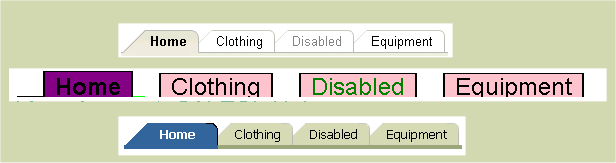
Create a skin - an overview
Let's get started and create a very simple skin so that you can see what files you need and where you need to put them. Later we'll go over more in depth features of skinning, like @agent support and icons vs styles vs properties. This is what most people do when they work with skinning. This includes some tips and tricks:- Create a skin
- Create a trinidad-skins.xml file and put it in your WEB-INF or META-INF of a jar file.
- Create a *.css stylesheet document that gets linked to your skin definition in trinidad-skins.xml
- Set trinidad-config.xml <skin-family> to be the skin-family of your skin.
- Optionally, if the skin has a version, set trinidad-config.xml <skin-version> to be the skin-version of your skin, or "default" if you want choose the skin marked to be the default for that skin family.
- Turn off styleclass name compression in web.xml (while creating the skin only then turn it back on for performance sake)
- Turn on check file modification in web.xml (while creating the skin only then turn it back off for performance sake)
- Install Firebug to help look at the DOM and the styleclasses
- Run a component or application to see the default mode. Your skin will extend the default skin, unless you specify otherwise (because you can extend any skin you want).
- Read the skin-selectors.html documentation for that component and also the :aliases (global selectors that affect more than one component, like text, background-color).
- Cross-reference the skin-selectors documentation with Firebug in case the renderer and the documentation have gotten out of sync (this shouldn't happen, and if it does, please log a JIRA-issue/bug)
- Decide what changes you want to make and add the Skin selectors/properties to your stylesheet.
- By default you'll need to restart your server to see your skin changes. To see your changes without restarting your server, set the web.xml parameter 'org.apache.myfaces.trinidad.CHECK_FILE_MODIFICATION' to true. However, you always need to restart the server to see skin property changes.
- Run your component to see the changes. NOTE: A frequently asked question is why don't I see my skin? The most frequently correct answer is that you forgot to add <tr:document> to your page. This kicks off the skin framework to create the skin's css file and link it to your page.
How to create a skin
To keep the first skin example simple, this section will explain what what files you need to create and change to create a bigfont skin. The bigfont skin does nothing more than change the default font for your application to be big, like 16px.Create a trinidad-skins.xml file
Create a file in your WEB-INF directory and name it trinidad-skins.xml. Alternatively, you can create this file in the META-INF directory of your jar file and it will be found if that jar is on your application's classpath.
          <?xml version="1.0" encoding="ISO-8859-1"?>

            <skins xmlns="http://myfaces.apache.org/trinidad/skin">
                <skin>
                    <id>
                        bigfont.desktop
                    </id>
                    <family>
                        bigfont
                    </family>
                    <!-- optional. If you want to version your skin, then you set the version.
                    This is useful if you want to keep the skin-family the same name, but you
                    have fixed bugs in the skin. The user can use the original version or the
                    new version by specifying skin-version in trinidad-config.xml.-->
                    <version>
                      <name>v1</name>
                      <default>true</default>
                    </version>
                    <!-- if you want this skin to be for a pda, use org.apache.myfaces.trinidad.pda as the render-kit-id -->
                    <render-kit-id>
                        org.apache.myfaces.trinidad.desktop
                    </render-kit-id>
                    <style-sheet-name>
                        skins/bigfont/bigfont.css
                    </style-sheet-name>
            <!-- we are extending the default, simple skin, so no need for this
                    <extends>xyz</extends>
            -->
            <!-- no need for this in our bigfont skin
                    <bundle-name>
                        org.apache.myfaces.trinidaddemo.resource.SkinBundle
                    </bundle-name>
            -->
                </skin>
            ... more skins could go here ...
            </skins>
- id - Each skin must have an id. This is a unique identifier for a skin. The syntax we use is bigfont.desktop. We put the .desktop in there to specify that this is for the desktop renderkit. You can also create a skin for the pda renderkit if you would like.
- family - Each skin must have a family. A skin belongs to a family and this is what you set in the trinidad-config.xml file under <skin-family>. Then the specific skin is chosen depending upon the renderkit that is being used on render. You can create a bigfont.pda skin that is also in the bigfont family. Then if a person is running your app with a pda, they would get the bigfont.pda skin. Otherwise, if you didn't have a bigfont.pda skin, they'd get the default skin which is simple.pda.
- version - Version is optional. Setting a version on your skin is useful if you tend to change your css to fix bugs. Instead of creating a new skin and updating the skin-family so the end user can choose the new skin (e.g., purple-release2), you can instead create a new skin with the same skin-family, and a version like release2. This way the skin-family in trinidad-config.xml will not have to change. The user can either change the skin-version or they can set it to "default" You can set the name element of the version, and optionally you can set the default element to true/false. The default skin will get picked if the trinidad-config.xml only specifies the skin-family.
- render-kit-id - The renderkit that this skin is designed for. The values can be org.apache.myfaces.trinidad.desktop or org.apache.myfaces.trinidad.pda.
-
style-sheet-name - This is your skin's stylesheet name url.
We try a few different means to get the style-sheet-name file as an URL object.
First, we try to get an URL for the non static urls, that is, urls that could change after the server has started:
- If style-sheet-name starts with "http:", "https:", "file:", "ftp:", or "jar:", then we create the URL by calling new java.net.URL(style-sheet-name).
- Else we create the URL by calling FacesContext's ExternalContext's getResource(style-sheet-name). (we prepend '/' if it isn't already there). This is how we find the style-sheet-name of the form "skins/bigfont/bigfont.css" when the file is in the application's project.
- extends - This is how you can extend another skin rather than the default simple skin. Say you like the purple skin but only want to change the font size. You'd extend the purple.desktop skin and change one selector in the css file to override the font size.
-
bundle-name - This is the package where the skin's resource bundle lives. Skinning text is not
recommended because you'll need to get the text translated for all the languages.
<bundle-name>org.apache.myfaces.trinidaddemo.resource.SkinBundle </bundle-name> -
translation-source - This is an EL binding that can point to a Map or a ResourceBundle. You can use this instead
of the bundle-name if you would like to be more dynamic in your skin translations at runtime. bundle-name takes precedence.
<translation-source>#{skinTranslationMap.contents}</translation-source>
Create your skin's stylesheet
In the previous step you created a trinidad-skins.xml which will create your skin. You also set the style-sheet-name to skins/bigfont/bigfont.css In your project directory, create the bigfont.css file to match the directory structure you specified in trinidad-skins.xml:?- skins ?--- bigfont ?--?--- bigfont.css
.AFDefaultFontFamily:alias {font-family: Tahoma}
.AFDefaultFont:alias {font-size: 16px}
In trinidad-config.xml set the skin-family and optionally the skin-version
Open the trinidad-config.xml file that is in your WEB-INF directory. Set <skin-family>bigfont</skin-family> This will set your skin to bigfont when you run your application. You can EL-bind the skin-family as well to dynamically change the skin at runtime. If the skin has a particular version you want, you can also set the skin-version element to the name of the skin's version. Remember, your page must have the <tr:document> tag on the page to kick off the skin framework. Now you have created your bigfont skin. You can run your page and you will see that the font size and font family are now different than they were with the default simple.desktop skin.Skinning a component - a step-by-step example
In the previous sections we discussed creating a skin that changes the font of your application. In this section, you'll learn how to skin an individual component. You'll need to read the skin-selectors documentation, and use tools like Firebug to figure out what to do when you have problems. The component we'll skin for this example is the panelBox component. First, familiarize yourself with the component. Run it with styleclass compression disabled, and view it with Firefox so you can get a feel for its dom structure. Look at the skin-selectors documentation for the available public skinning keys. We recommend against using html elements in your skin selectors because the rendering could change. Sticking with public skinning keys will lessen the chance that your skin will have to change if the renderer changes. From reading the documentation and viewing the panelBox component demo, you'll see that the panelBox has an attribute "background" that can be transparent, light, medium, dark. The panelBox's skin selectors are af|panelBox::transparent, af|panelBox::light, af|panelBox::medium, af|panelBox::dark when the background=transparent, light, medium, dark respectively. These selectors render on the root dom element as the documentation states. You want to change the panelBox from the simple skin look to the purple look: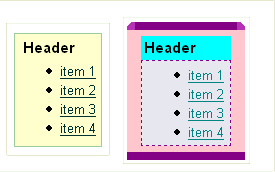
Since you only want to change the medium panelBox, you need to use descendent selectors and have the parent selector be af|panelBox::medium. You can see that the body is pink, so in your skin's css file you add this:
af|panelBox::medium af|panelBox::body {
  background-color: pink;
}
af|panelBox::medium af|panelBox::body {
  padding: 6px;
  background-color: pink;
}
af|panelBox::medium af|panelBox::header {
  background-color: Aqua;
}


/* for all panelBox headers, make the font bold */
af|panelBox::header {
  font-weight: bold;
  padding: 2px;
}
You see that the content part of the panelBox needs a different color background and a dashed border and maybe some padding. You add this to your css file:
af|panelBox::medium af|panelBox::content {
  background-color: #E7E4EA;
  border-color: purple;
  border-style: dashed;
  border-width:1px;
  padding-right: 6px;
  padding-left: 6px;
}
Now you need the borders around the sides of the panelBox and the curved top-left and top-right. You add this:
/* rounded corners on the top-start and top-end */
af|panelBox::medium af|panelBox::top-start,
af|panelBox::medium af|panelBox::top-end:rtl {
  background-image: url(/skins/purple/images/panelBoxStart.gif);
  width:8px;
  height:8px
}

af|panelBox::medium af|panelBox::top-end,
af|panelBox::medium af|panelBox::top-start:rtl {
  background-image: url(/skins/purple/images/panelBoxEnd.gif);
  height: 8px;
  width:  8px;
}

af|panelBox::medium af|panelBox::top {
  background-color: purple;
}

/* make the bottom have a background color and some padding, no rounded corners */
af|panelBox::medium  af|panelBox::bottom-start,
af|panelBox::medium af|panelBox::bottom-end,
af|panelBox::medium af|panelBox::bottom {
  background-color: purple;
  padding-top: 8px;
}

af|panelBox::medium af|panelBox::start,
af|panelBox::medium af|panelBox::end {
  background-color: pink;
}
Let's say for all panelBoxes other than medium, you want a background-color of yellow for the body. You can either do this:
af|panelBox::transparent af|panelBox::body,
af|panelBox::light af|panelBox::body,
af|panelBox::dark af|panelBox::body {
 background-color: yellow;
}
/* for all body, if doesn't have medium set, use yellow for the background-color */
/* The af|panelBox::medium af|panelBox::body {} definition above will take precedence over this alias
so the medium panelBox's body will be pink, not yellow */
.AFPanelBoxBody:alias {
 background-color: yellow;
}
Skinning Keys
This section is to help you understand the different kinds of skinning keys: component-level skinning keys, alias skinning keys, state skinning keys, skinning properties, and icon skinning keys. Other names for a skinning 'key' is skinning 'selector' or skinning 'hook'. This section will go over the skinning key syntax and their use. It is highly recommended that you familiarize yourself with the W3c's CSS specification regarding selectors, pseudo-elements and pseudo-classes. With this knowledge, skinning will be much easier.Component-level skinning keys
This section will explain the syntax of a component-level skinning key and the pseudo-elements. In css, if you want to style a P element, you do the following:P {color: red }
Similarly, if you want to style the af:inputText component using a skin selector, you would do this:
af|inputText {color:red }
The pseudo-element syntax is used to style pieces of a component. From the css spec, here is an example of how to skin the first line of a 'p' element:
p::first-line { text-transform: uppercase }
The Trinidad components also have pieces to them, like label, content, start-top, etc, and they are skinned using the appropriate pseudo-element defined in the skin-selectors document. Here is an example of some of the pseudo-element skin selectors for inputText.
- af|inputText {...} - the entire component. renders on the root dom element
- af|inputText::label {} - the label
- af|inputText::content {} - the content (input element)
Alias skinning keys
Why do we need alias keys? Let's say you have a css-2 stylesheet for your page. You might define a bunch of style classes, and you might have font-style: Tahoma as your font-style of choice for all the style classes that are used for setting font. You might see a stylesheet like this:
    .AFInstructionText {font-family:Tahoma, Verdana, Helvetica, sans-serif;font-weight:normal;font-size:11px;color:#000000}
    .AFInstructionTextDisabled {font-family:Tahoma, Verdana, Helvetica, sans-serif;font-weight:normal;font-size:11px;color:#999999}
    .AFDataText {font-family:Tahoma, Verdana, Helvetica, sans-serif;font-size:11px;font-weight:bold;color:#000000}
    .AFDataTextDisabled {font-family:Tahoma, Verdana, Helvetica, sans-serif;font-size:11px;font-weight:bold;color:#999999}
        af|inputText::label,
        af|inputChoice::label,
        af|selectOneChoice::label, etc. {color:blue}
        af|inputText::label,
        af|inputChoice::label,
        af|selectOneChoice::label, etc. {-tr-rule-ref: ".AFLabel:alias"}
        .AFLabel:alias { color: blue }
          In your CSS file you can change the color of all the labels like this:

          .AFLabel:alias {color: red}
State skinning keys
In CSS there are pseudo-classes, like :hover, :active, :focus. We consider these 'states' of the component. We use this same concept in skinning components. Components can have state, like read-only or disabled. We use the pseudo-class syntax to denote state in skinning selectors. For example, you can style the label when the component is disabled by writing this selector:
        af|inputText:disabled::label {color:gray}

        This generates:
        .af_inputText.p_AFDisabled .af_inputText::label {color:gray}

        It works on this html:

        <span class="af_inputText p_AFDisabled"><span class="af_inputText_label>Label</span></span>
Skinning properties
Skinning properties are skin css properties that are essentially a key that will be stored in the Skin object with the value. The renderer uses the skin property when it is rendering. The skin properties are documented in skin-selectors documentation. They are available for the skin to use as a way to customize the rendering of a component application-wide, not per-instance. per-instance customizations are component attributes. An example of a skin property is -tr-show-last-item for the navigationPath component. In your skin's css file you can specify whether you want the last item to be shown or not.
          /* For all instances of the navigationPath in the application, do not show the last item */
          af|navigationPath {-tr-show-last-item: false}
Icon skinning keys
Some components render icons (<img> tags) within them. For instance the inputDate has a launch icon. Chances are you will want to skin the icons. Even though these icons are not rendered with CSS, like background-image, they are still skinnable in the Skin CSS file. All icon skin keys end with '-icon' or 'Icon:alias'. icons do not get generated to the CSS-2 stylesheet. Instead they get registered with the Skin object and the renderer uses the icon when it is rendering, e.g., Icon obj = skin.getIcon("af|foo::date-icon"); It will use your skinned icon if you have skinned it. Otherwise, it will use the base skin's icon. Note that CSS-syntax like pseudo-classes (:hover, etc) and descendent selectors and composite class selectors do not work with icon selectors. Remember, if you create your own skin selectors, do not end with the name with -icon or 'Icon:alias' if it is for a css style; it will get created as an Icon object.
              af|inputDate::launch-icon {
                content:url(/skins/purple/images/dateButtonPurple.gif);
                width:19px;
                height:24px
              }
              af|inputDate::launch-icon:rtl {
                content:url(/skins/purple/images/dateButtonPurpleRTL.gif);
                width:19px;
                height:24px
              }
              /* You can use a 'text' icon instead of an image icon if bandwidth is a concern, for example */
              af|foo::help-icon {
                content: '?';
              }
Specifying urls
Trinidad's skinning engine supports five URL types: absolute, relative, context relative, server relative and base64 encoded images.- Absolute URLs specify the complete URL to the resource, including the protocol (e.g. http://).
- Relative URLS are used if the specified url does not start with a slash ("/") and if there's no protocol present. A relative URL is based on the skin's CSS file location. For instance, if the skin CSS file is located in MyWebApp/skins/mySkin/ and the specified url is skinImages/myImage.gif, then the final URL will be /MyWebApp/skins/mySkin/skinImages/myImage.gif.
- Context relative URLS are resolved relative to the context root of the web application. To use them, you simply have to make it start with a single slash ("/"). For instance, if the context root is /MyWebApp and the specified URL is /images/myImage.jpeg, the resulting URL will be /MyWebApp/images/myImage.jpeg.
- Server relative URLS are resolved relative to the web server as opposed to the context root. This allows you to easily refer to resources located on another application on the same server. To use this type of URL, the specified URL must start with two slashes ("//").
- base64 encoded image URLS are images embedded directly into the CSS file. This should follow the "data" URL scheme specified in rfc2397 i.e. data:image/[imagetype];base64,[data]
- Absolute url(http://www.mycompany.com/MyWebApp/skins/mySkin/skin_images/ObjectIconError.gif);
- Relative url(skin_images/ObjectIconError.gif);
- Context relative url(/skins/mySkin/skin_images/ObjectIconError.gif);
- Server relative url(//MyWebApp/skins/mySkin/skin_images/ObjectIconError.gif);
Skinning Text
Text our components render is translatable. The text is abstracted out as resource bundle keys. With skinning you can override resource bundle key values. These key values should be documented in skin-selectors.xml, but if they are not (they are not currently for the Trinidad components), then you'll have to look at the CoreBundle.xrts/.java source file for the keys. The resource bundle key/values are not skinned in the skin's css file. Instead they are skinned in a Map or ResourceBundle and you point to that from your skin definition in trinidad-skins.xml. Let's go through an example. Let's say you want to skin the ShowDetail disclosed tip. Let's say the 'key' is af_showDetail.DISCLOSED_TIP. You would:- Create a ResourceBundle file(s) that sets your new value for this key and any other keys you want to change the value for, one file per language.
- Set bundle-name in the trinidad-skins.xml file for your custom skin.
- Package your skin and resource bundle classes together in the jar.
      public class SkinBundle extends ListResourceBundle
      {
        @Override
        public Object[][] getContents()
        {
          return _CONTENTS;
        }

        static private final Object[][] _CONTENTS =
        {
          {"af_tableSelectMany.SELECT_COLUMN_HEADER", "Select A Lot"},
          {"af_tableSelectOne.SELECT_COLUMN_HEADER", "Select Just One"},
          {"af_showDetail.DISCLOSED_TIP", "Click to Hide"}
        };
      }
     <skin>
        <id>
            purple.desktop
        </id>
        <family>
            purple
        </family>
        <render-kit-id>
            org.apache.myfaces.trinidad.desktop
        </render-kit-id>
        <style-sheet-name>
            skins/purple/purpleSkin.css
        </style-sheet-name>
        <bundle-name>
            org.apache.myfaces.trinidaddemo.resource.SkinBundle
        </bundle-name>
    </skin>
        The directory structure of your skin jar would look like:
        META-INF
        META-INF/trinidad-skins.xml
        META-INF/org/apache/myfaces/trinidaddemo/resource/SkinBundle.class & SkinBundle_fr.class
public class SkinTranslationMapDemo
{
  /* Test a skin's translation-source EL pointing to a Map */
  public Map<String, String> getContents()
  {
    return _CONTENTS;
  }

  static private final Map<String, String> _CONTENTS = new HashMap<String, String>();
  static
  {
    _CONTENTS.put("af_inputDate.LAUNCH_PICKER_TIP", "Launch PickerMap");
    _CONTENTS.put("af_showDetail.DISCLOSED_TIP", "Hide Tip Map");
    _CONTENTS.put("af_showDetail.DISCLOSED", "Hide Map");

  }
}
      <skin>
        <id>
            purple.desktop
        </id>
        <family>
            purple
        </family>
        <render-kit-id>
            org.apache.myfaces.trinidad.desktop
        </render-kit-id>
        <style-sheet-name>
            skins/purple/purpleSkin.css
        </style-sheet-name>
        <translation-source>#{skinTranslationMap.resourceBundle}</translation-source>
    </skin>
Skinning CSS features
Re-using selectors and properties via -tr-rules
You can do things in a skin css file beyond what you can do in a regular css file. At runtime the skin framework processes the skin's css file and the skin framework pulls out skinning properties and icons and registers them with the Skin object. The skinning framework merges styles together that use the -tr-rule-ref property. The skinning framework picks the styles based on the HTTP request information, like agent and platform and merges them with the non-specific styles. This section will go into more detail on these features and how you can use them in your skinning css file.- Skin properties e.g., af|breadcrumbs{-tr-show-last-item:false}. Skin properties for a component are documented in the skin-selectors documentation. Skin properties are useful if you want to control the rendering of a component that css alone cannot do, like displaying the last item or not (well, css might be able to do that). The writer of the renderer may choose to expose skin properties to enable the application developer to have more control over the way the component renders without having to write their own renderer. Another example is af|train {-tr-visible-stop-count: 10}. This allows you to change the number of visible train stops.
-
-tr-inhibit - > e.g., af|foo {-tr-inhibit: padding; color: red}
This css property is used to inhibit/reset css properties that you are inheriting from a base skin.
"-tr-inhibit: all" will clear out all the inherited properties. "-tr-inhibit: property-name" will inhibit the
property name; "-tr-inhibit: padding", for example, will clear out any padding
that you have inherited. You need to make sure your property-name matches that in the base skin. If the
base skin has padding-right: 6px and you inhibit padding, you will still get the padding-right. You need
to inhibit padding-right. Also note that inhibitions happen when the skinning framework processes the skin's css file,
and not based on cascading rules in the browser. Therefore the skin selector has to match and the property name has
to match exactly to what you are inhibiting. -tr-inhibit works for style selectors, icons
(selectors that end with -icon) and skinning properties.
Skin A: af|breadCrumbs { -tr-show-last-item: false; } Skin B extends Skin A: af|breadCrumbs { -tr-inhibit: -tr-show-last-item;} Skin A does not show the last breadcrumb. Skin B does show the last breadcrumb. -- Skin A .SomeStyleClass { color: red; font-size: 11px; } Skin B .SomeStyleClass { -tr-inhibit: color; } Skin A has color: red, but Skin B has no color, since it has been inhibited. -- Skin A .SomeStyleClass { color: red; font-size: 11px; -tr-inhibit: color; } This definition makes no sense. If your intent is to remove the color attribute, then you should simple say: .SomeStyleClass {font-size: 11px} You shouldn't be setting a property, then inhibiting it in the same definition, or even the same skin. Inhibits happen first in the same rule, then the specific styles, so if you inhibit a property, and also define a property in the same rule, it won't be inhibited. However, if you define .SomeStyleClass {-tr-inhibit: color;} later in Skin A, it will be inhibited. Again, do not inhibit within the same skin. It takes more programming cycles to do the merge, and your css isn't as clean. -
-tr-rule-ref - > This is used to include other styles in your style see :alias
section. Application developers probably won't use this. This is meant for component developers to use when
they are setting up the base skin for their components.
Here are some examples of how you can use -tr-rule-ref and what the generated css would be.
Example 1: Skin A .AFSomeAlias:alias {color: red} .foo {-tr-rule-ref: selector(".AFSomeAlias:alias")} Skin B extends Skin A .AFSomeAlias:alias {color: blue} Result If you run Skin A, you will see in your CSS .foo {color: red} In you run Skin B, you will see in your CSS .foo {color: blue} because the alias that .foo includes (.AFSomeAlias:alias) in Skin A has overwritten its color property in Skin B to blue. --- Example 2: Skin A .myClass {color: orange} Skin B extends Skin A .MyBlueColor:alias {color: blue} .myClass {color: pink; -tr-rule-ref: selector(".MyBlueColor:alias")} If you run Skin A, you will see in your CSS .myClass {color: orange} In you run Skin B, you will see in your CSS .myClass {color: pink} In Skin B's definition for .myClass, all 'includes' (like -tr-rule-ref) get merged in first, then specific property definitions (like color in this case) get merged in last for the rule. Therefore, color: pink overwrites -tr-rule-ref: selector(".MyBlueColor:alias"); However, if you define .myClass {-tr-rule-ref: selector(".MyBlueColor:alias")} later in Skin B, it will be blue. If you are unsure of what includes or inhibits resolve to, you can run your own skinning test like above, and look at the generated css file. - -tr-property-ref - > This is used to include properties from one style into another. The syntax of -tr-property-ref is: background-color: -tr-property-ref("af|foo","color"), where the first parameter is the style from which the property is included and the second one is the name of the included property in that style. There can be more than one occurrence of -tr-property-ref in a property value, for example: background: -webkit-linear-gradient(top, -tr-property-ref("af|foo","color") 0%, -tr-property-ref("af|bar","color") 100%); When the property included has the same name as in the including selector, the following syntax can also be used: background-color: -tr-property-ref("af|foo") instead of: background-color: -tr-property-ref("af|foo", "background-color"). This is useful when only some properties from another style are needed to be included. In this case, we won't need to include the entire style via a -tr-rule-ref rule, but only the needed property.
-
+/- - > This feature of the skinning framework allows you to set
a selector's color or font that is relative to another selector's color or font.
This is useful if you have color ramps. You can change the color in one place. An example
for the color is:
The same thing works for fonts.
.BaseBG:alias { background-color: #0099ff; } .fooColorTest { -tr-rule-ref: selector(".BaseBG:alias"); background-color: +#333333;} .fooColorTestMinus { -tr-rule-ref: selector(".BaseBG:alias"); background-color: -#333333; } this resolves to .fooColorTest {background-color:#33ccff} .fooColorTestMinus {background-color:#0066cc}.FontSizeTest:alias {font-size: 12pt;} .fooFontTest { -tr-rule-ref: selector(".FontSizeTest:alias"); font-size:+1pt; }
Server side at-rules
You might not want your selector's css properties to be applied to all browsers, all platforms, all locales, and both reading-directions. For example, you might have to tweak some padding in IE that you don't need on any other browser. You might want the font-style to be different on Windows than it is on other platforms. To style a selector for a particular user environment, you put that skinning information inside a skinning framework @rule or ':rtl' pseudo-class. The skinning framework picks the styles based on the HTTP request information, like agent and platform and merges them with the styles without rules. These css properties that match the 'rules' get merged with those outside of any 'rules'; the most specific rules that match a user's environment take precedence. These rules are resolved at server side and matching selectors are rendered for the user agent. (See an example in the css code below.) The skinning framework currently supports these server side 'rules':- @import Use @import to import style rules from other skinning css files. The URL of the file you are importing is relative to the skin file you are importing into. The following syntax is supported: @import "purpleBigFont.css"; @import url("purpleBigFont.css"); @import url(purpleBigFont.css);
-
@platform {/skin definitions go here/} - >
Possible values are:
- windows
- macos
- linux
- solaris
- ppc
- iphone
- blackberry
- nokia_s60
- genericpda
- android
- unix
-
@agent {/skin definitions go here/} - >
Possible values are:
- netscape (for Netscape Navigator browser)
- ie (for the Microsoft Internet Explorer browser)
- gecko or mozilla (for browsers based on the Gecko Layout Engine, eg: Mozilla, Netscape 7.0+)
- elaine (Palm Web clipping)
- ice or icebrowser (for the ICE Browser)
- pixo (for the Pixo Microbrowser)
- wml (for the WML Microbrowser)
- simple-result (for SimpleResult intermediate Form)
- ptg (for iAS wireless (PTG) client)
- netfront (for the NetFront browser)
- webkit (for the Safari browser)
- blackberry (for the BlackBerry browser)
- nokia_s60 (for the Nokia S60 browser)
- genericpda (for the basic HTMLbrowser)
- konqueror (for Konqueror)
- email (for email)
- opera (for opera browser)
- googlebot (for Google web crawler)
- msnbot (for Bing web crawler)
- oracle_ses (for Oracle SES)
- genericDesktop (for generic desktop)
Matches any version of Internet Explorer Agent type may be optionally followed by "and" separated version rules:@agent ieMatches any 6.x version of Internet Explorer Rules may be OR'ed together using comma-separated rules:@agent ie and (version: 6)Matches either Internet Explorer version 6.x or Internet Explorer version 7.x or Gecko engine version 1.9 (in FireFox for example). These are the same:@agent ie and (version: 6), ie and (version: 7), gecko and (version: 1.9)So to match only 6.0.x use:@agent ie and (version: 6.*) @agent ie and (version: 6)
Similarly, you can use max-version and min-version to specify ranges of versions. The rule:@agent ie and (version: 6.0)
can be written as:@agent ie and (version: 6), ie and (version: 7), gecko and (version: 1.9)You can use touchScreen to specify styles/selectors for touch screen devices. Agent captures a capability named "touchScreen" which is set to none, single or multiple.@agent ie and (min-version: 6) and (max-version: 7), gecko and (version: 1.9)Matches the corresponding touchScreen agent capability. A short cut provided to specify any touchScreen device is:@agent (touchScreen:none) @agent (touchScreen:single) @agent (touchScreen:multiple)Matches all agents with touchScreen capability set to single or multiple. You may notice that we have not specified agent name for the touchScreen examples till now. Agent name is made optional for touchScreen rules.@agent (touchScreen)Matches webkit run on all touch devices (single or multiple touch). touchScreen can be specified with multiple ANDs and ORs as well.@agent webkit and (touchScreen)Matches single touch device running version 9 of webkit.@agent webkit and (version: 9) and (touchScreen:single)Matches either version 9 of Internet Explorer or agent with multiple touch capability.@agent ie and (version: 9), webkit and (touchScreen:multiple) - @accessibility-profile {/skin definitions go here/} - > Possible values are: high-contrast, large-fonts. This is to define styles only for a particular accessibility profile. See the Configuring Apache Trinidad chapter for information on setting the accessibility profile.
- @locale {/skin definitions go here/} - > A certain locale must be specified, either only the language or both the language and the country. This is to define styles only for a particular language and country.
- @mode {/skin definitions go here/} - > Possible values are quirks or standards. This is to define styles particular only for browser quirks or standard mode.
/** for ie and gecko on windows, linux and solaris, make the color pink **/
@platform windows, linux, solaris
{
  @agent ie, gecko
  {
    af|inputText::content {background-color:pink}
  }
}

af|someComponent {color: red; width: 10px; padding: 4px}

/* for ie, we need to increase the width, so we override the width.
We still want the color and padding; this gets merged in. We want to add height in IE.  */
@agent ie
{
  af|someComponent {width: 25px; height: 10px}
}

/* for ie 5 and 6, we also need some margins.*/
@agent ie and (version: 5), ie and (version: 6)
{
  af|someComponent {margin: 5px;}
}

/* for Firefox 3 (gecko 1.9) use a smaller margin.*/
@agent gecko and (version: 1.9)
{
  af|someComponent {margin: 4px;}
}

@locale en, de {
   af|commandButton {
      color: red;
   }
 }
 @locale ro-RO {
   af|commandButton {
     color: blue;
   }
 }

/* The following selectors are for all platforms and all browsers */

/* don't use the base skin's background-image */
af|navigationPane::tabs-active af|navigationPane::tabs-bottom-start-content {
  -tr-inhibit: background-image;
}

/* this should end up with  .portlet-form-input-field {padding: 8px} */
.portlet-form-input-field {
/* This should first inhibit all inherited styles. Then everything else
   should be included.*/
  -tr-inhibit: all;
  padding: 8px;
  /* This should inhibit the background-color that is inherited and/or included,
  like in .AFLightAccentBackground:alias
  The order of this does not matter. */
  -tr-inhibit: background-color;
  -tr-rule-ref: selector(".AFLightAccentBackground:alias");
}
Client side at-rules
If you want to use rules that are supported out of the box by CSS like @document, @media etc, you can specify those rules in the skin file and expect them to be rendered directly into the browser. These rules will be evaluated by the browser and styles will get applied if the browser passes the conditions mentioned in the rules. The skinning framework currently supports these client side 'rules':- @document
- @font-face
- @keyframes
- @media
- @page
- @supports
Notes:
- Styles inside client side at-rules cannot be used with tr-rules. This is because, in server side, we do not know if the referred style will be rendered. On the contrary, tr-rules can be used inside client side at-rules to refer styles or properties define outside client rules.
- Aliases cannot be specified inside client rules. Aliases are evaluated at the server side, and thus we cannot pick aliases based on client rules.
af|document {
  background-color: white;
  background-image: url('/skins/custom-base/top-band.png'), url('/skins/custom-base/texture.png');
  background-repeat: repeat-x, repeat;
  background-position: top left, top left;
  background-size: 10px 61px, 6px 6px;
}

/* specify different background-image for min-device-pixel-ratio = 2 */
@media only screen and (min-device-pixel-ratio: 2) {
  af|document {
    background-image: url('/skins/custom-base/top-band@2x.png'), url('/skins/custom-base/texture@2x.png');
  }
}

/* specify different background-image for min-resolution: 2dppx*/
@media only screen and (min-resolution: 2dppx) {
  af|document {
    background-image: url('/skins/custom-base/top-band@2x.png'), url('/skins/custom-base/texture@2x.png');
  }
}

.Some:alias {
  color: red;
  background-color: green;
}

@media only screen {
  af|mystyle {
    -tr-rule-ref: selector(".Some:alias");
  }
  af|mystyle2 {
    background-color: -tr-property-ref(".Some:alias","color");
  }
}
Client side at-rules can be nested in server side at-rules and vice versa. One slight deviation is for @page and @font-face rules. These can be wrapped in a server side at-rule, but cannot contain a inner server side at-rule because these rules directly contain CSS properties unlike other client side at-rules which contains complete styles.
@agent gecko {
  @page:first {
    margin:2in;
  }
}

@keyframes mymove {
  @agent gecko {
    0% { top: 0; left: 0; }
    30% { top: 50px; }
    68%, 72% { left: 50px; }
    100% { top: 100px; left: 100%; }
  }

  @agent ie {
    0% { top: 1; left: 1; }
    30% { top: 100px; }
    100% { top: 200px; left: 100%; }
  }
}
Server side pseudo classes
Generally, pseudo classes are executed at the client side. CSS supports pseudo classes such as ":hover", ":focus" etc and these pseudo classes are rendered as is into the CSS generated by skinning framework and gets applied by the browser automatically. There are some special pseudo classes supported by skinning framework, which are evaluated at the server side. These pseudo classes are not rendered into the generated CSS, but the decision to render the selector is taken at the server side base on the user agent or application configuration.- :ltr - > pseudo-class to create a style or icon definition when the browser is in a left-to-right language.
-
:rtl - > pseudo-class to create a style or icon definition when
the browser is in a right-to-left language. The best example is that of images that
are not symmetric. If you set a skin selector that uses a asymmetrical image, when
you set your browser to the right-to-left reading direction, then you want your
image to be flipped. To do this, you use the :rtl pseudo-class at the end of your
selector and point it to a flipped-looking image.
/* rounded corners on the top-start and top-end */ /* shows how to use :rtl mode pseudo-class. The start image in ltr mode is the same as the end image in the right-to-left mode */ af|panelBox::medium af|panelBox::top-start, af|panelBox::medium af|panelBox::top-end:rtl { background-image: url(/skins/purple/images/panelBoxStart.gif); width:8px; height:8px } af|panelBox::medium af|panelBox::top-end, af|panelBox::medium af|panelBox::top-start:rtl { background-image: url(/skins/purple/images/panelBoxEnd.gif); height: 8px; width: 8px; } - :lang - > Not yet implemented in Trinidad.
Package your Skin in a JAR file
If you want another application to be able to use your skin, you can package it up into a JAR file, and include the JAR on the application's classpath. The Skinning Framework finds all META-INF/trinidad-skins.xml files on the classpath. To package up your skin into a JAR file, you need this directory structure:- META-INF/trinidad-skins.xml
- META-INF/skins/yourSkin.css
- META-INF/adf/yourImages
- META-INF/trinidad-skins.xml
- META-INF/skins/purpleSkin.css
- META-INF/adf/images/*.png
      <style-sheet-name>
        skins/purpleSkin.css
      </style-sheet-name>
background-image: url(../adf/images/progressbar_empty.png)
background-image: url(/adf/images/progressbar_empty.png)
background-image:url(/trinidad-demo-context-root/adf/images/progressbar_empty.png);
	<servlet-mapping>
	<servlet-name>resources</servlet-name>
	<url-pattern>/adf/*</url-pattern>
	</servlet-mapping>
Tips and Tricks
View uncompressed styleclass names
When you run a page and view the html source, you will see styleclasses like class="x10". To see instead something more meaningful like class="af_inputText_content" you need to disable the styleclass compression which is enabled by default for performance reasons. To disabled the compression, you need to add this to the web.xml file:
        <context-param>
         <param-name>org.apache.myfaces.trinidad.DISABLE_CONTENT_COMPRESSION</param-name>
         <param-value>true</param-value>
        </context-param>
See your skin changes with refresh of browser
When you change your skin css file, you will need to stop/restart the server to see your changes unless you set the check file modification flag in your web.xml file. If that flag is set, then you can refresh your browser to see your css changes, though currently you will not see your server-side changes which are 'icon' and 'server-side skin properties'. Remember to set this back to false when you are done for performance sake.
        <context-param>
         <param-name>org.apache.myfaces.trinidad.CHECK_FILE_MODIFICATION</param-name>
         <param-value>true</param-value>
        </context-param>
Firebug
Install Firebug on Firefox. With this tool you'll be able to view the rendered components and the css properties of the various dom elements. This will help you figure out what skin selectors are causing the css styling. Alternately, you can view the rendered CSS file itself. To map a rendered styleclass to a skin selector you'll need to look at the skin-selectors.html document.
          A skin selector like :

          "af|panelBox" gets generated as ".af_panelBox"

          "af|inputText:read-only::content" gets generated as ".af_inputText.p_AFReadOnly .af_inputText_content".

          Any non-css-2 pseudo-classes gets generated as .p_AF*, otherwise they pass through.

          "af|commandLink:hover" gets generated as ".af_commandLink:hover"
Simple (default) skin
To see what you get out of the box without any skinning on your part, you should run the simple skin, which is the default. You can use Firebug, or view the generated css file. Or, if you look have the source code, you can look at base-desktop.xss or simple-desktop.xss. These files are not public and are in in an xml-based format, not CSS, so it might be harder to understand. If you get some property from the base skin that you don't want, you can use the -tr-inhibit property: af|foo {-tr-inhibit: all} to inhibit all the base skins' properties and start fresh.or
af|foo {-tr-inhibit: padding} to inhibit the padding css property.
The property name has to match the base skin's property exactly, so looking at the base-deskop.xss will help.
W3C's CSS specification
You need to be very familiar with CSS to do complex skinning. Some useful concepts to know are the different types of selectors, like descendent selectors, composite class selectors, and selector specificity. You can look at the w3c's css spec for detailed information. Selector specificity is really important to understand, because you might get into a situation where you are not sure why your style is not getting picked up. It could very well be that the base skin has a selector that is more specific than your selector and thus the browser gives it more weight regardless of the position in the generated css file.Using the styleClass attribute
You can skin a particular instance of a component by combining the skin selectors and the component's styleClass attribute value. For example, you can put a styleclass on the commandLink component and then skin it
          <tr:commandLink styleClass="myCommandLink">

          /* style any commandLink components that have their styleClass attribute set to 'myCommandLink' */
          af|commandLink.myCommandLink {color: red}
Performance when many different skins in an application
The skinning framework caches information for the generated css file for each skin that is requested. This could be a source of a memory leak if your application is built to use many different skins, like each user has his own custom skin. Fortunately, this is not a common usecase. In this case, you would want to limit the number of generated css files we cache in our LRUCache (least-recently used cache). You can do this by specifying the maximum number of skins you want to cache with the web.xml context-param org.apache.myfaces.trinidad.skin.MAX_SKINS_CACHEDSkinning for Custom Component Developers
This section is for a custom component developer. This section is not for someone who is skinning their application. If you created your own custom component, and you want this component to work well with other existing skins, then you need to create a skin-addition. A skin-addition gives you a way to 'push' your own stylesheet and resource bundle for your components into existing skins, most likely the simple skin. Then you can jar up your component and skin information and your component can be used by others. (Another way to do the same thing is to open up the simple-desktop.xss file and other skin css files, and add your skin definitions there. This is not practical if you don't own this source.) Skin objects contain zero or more SkinAdditions. The SkinAdditions' stylesheets are merged into the Skin's own stylesheet. The SkinAdditions' resource bundle is looked at along with the Skin's own resource bundle when Skin's getTranslatedValue is called by your renderer.Creating a skin addition declaratively
Create a skin stylesheet file (say, myComponents-simple-desktop.css) that defines your icons, styles, and properties so that your components will fit in with the simple.desktop skin (or whatever skin you want to fit in with). Use the Skin Selector Aliases as much as possible. This way if a person wants to change the default font for the entire application, he can create a skin that changes the .AFDefaultFont:alias and your component's font will change, too. If you didn't include the alias in your skin selector properties, then your font won't change. (See Skin-Selectors.html documentation) Register this StyleSheet file with the simple.desktop skin. Create a META-INF/trinidad-skins.xml file if you don't already have one.
          <?xml version="1.0" encoding="ISO-8859-1"?>

            <skins xmlns="http://myfaces.apache.org/trinidad/skin">
                <skin-addition>
                    <skin-id>
                        simple.desktop
                    </skin-id>
                    <style-sheet-name>
                        styles/myComponents-simple-desktop.css
                    </style-sheet-name>
                    <bundle-name>
                        org.mycompany.view.resource.myComponentsResourceBundle.java
                    </bundle-name>
                </skin-addition>
            ... more skins or skin-additions could go here ...
            </skins>
- skin-id - The id of the skin you are 'pushing' your styles into.
- style-sheet-name - This is your skin's stylesheet name url. This should be a uniquely name path, since we use ClassLoader getResource to find this file, and if another jar has the same style-sheet-name, it might find that file and not yours.
- bundle-name - This is the package where the skin's resource bundle lives. This is important for a custom component developer so that the component's text supports different languages.
Serving up your stylesheet's image urls
Feel free to jar this file up with your other files, because we can find trinidad-skins.xml files in the META-INF directory. However, we can't automatically find any image urls; so if you have image urls, like background-image: url("../arrow.png"); in your myComponents-simple-desktop.css file, you'll have to either put the images relative to the servlet context (start with a /), or create a ResourceLoader and make the path relative to the css file, like "../../xyz/images/drill.gif". These are the steps to create your own ResourceLoader:- Add an extra servlet-mapping to web.xml for your resource path, like "/xyz/*" as opposed to "/adf/*".
-
Create a ResourceLoader file, like org.mycompany.resource.XYZResourceLoader
package oracle.adfinternal.view.faces.xyz.resource; import org.apache.myfaces.trinidad.resource.ClassLoaderResourceLoader; import org.apache.myfaces.trinidad.resource.RegexResourceLoader; import org.apache.myfaces.trinidad.resource.ResourceLoader; public class XYZResourceLoader extends RegexResourceLoader { public XYZResourceLoader(ResourceLoader parent) { register("(/.*\\.(css\|jpg\|gif\|png\|jpeg\|js\|svg))", new ClassLoaderResourceLoader("META-INF", parent)); } } - Create a .resources file and place it in META-INF/servlet/resources. In the file, place a single line that references the resource loader class. For example, create an xyz.resources file with the following single line: org.mycompany.resource.XYZResourceLoader
- Place the .resources file in your JAR, so its path is META-INF/servlet/resources/xyz.resources.
- Add resources in your jar at the following location: META-INF/xyz/*, which needs to match the servlet-mapping
- Create a URL reference to the image with "xyz" in the path.
- all files created above should be in the same JAR that contains your custom components/faces-config.xml/etc.
Pre-generating Skin Style Sheets
Trinidad skin definitions are dynamically converted into browser-consumable style sheets (.css files) at runtime. While a runtime-based approach is suitable for most application deployments, in some cases it may be desirable to offload style sheet delivery to some other server, eg. to a server that is managed by a CDN provider, or even just to a static http server that can be shared across multiple applications. Trinidad provides a skin pre-generation "service" to address such cases.
The skin pre-generation service can be accessed from any Trinidad-based application. To enable this service, simply specify the following system property when starting up the application server:
-Dorg.apache.myfaces.trinidad.SKIN_PREGENERATION_SERVICE=on
Enabling the skin pre-generation service causes a special "/-tr-pregenerate-skins" view id to be exposed. Requests into this view trigger pre-generation, which produces a set of static style sheet files that can then be copied/uploaded to some other server.
The /-tr-pregenerate-skins view id requires one mandatory request parameter: id. The value of this parameter must be an id of one of the skins registered with Trinidad.
For example, in an application that uses prefix mapping for the FacesServlet, enabling the skin pre-generation service exposes the following uri:
/context root/faces/-tr-pregenerate-skins?id=minimal.desktop
Hitting this uri triggers pre-generation of style sheets for the minimal.desktop skin.
Skin pre-generation can be slow and can produce a significant amount of content, particularly for large skins with many variants. To compensate for this, only style sheets for the most common variant values are generated by default. In particular, style sheets corresponding to the following variants are generated:
- plaform: android | iphone | linux | macos | windows
- agent: ie | gecko | webkit
- locale: default (unmatched) locale
- reading direction: ltr
- accessibility: standard contrast, medium fonts
The "variants" request parameter can be used to force generation of all possible style sheets. For example, specifying variants=all:
/context root/faces/-tr-pregenerate-skins?id=minimal.desktop&variants=all
Will result in in pre-generation of every possible style sheet for the minimal.desktop skin.
In addition to the "variants" request parameter, the following optional request parameters may be used to provide information about how pre-generation should be performed:
- containerType: servlet | portlet. (Defaults to "servlet".)
- requestType: nonsecure | secure. (Defaults to "nonsecure".)
- styleClassType: compressed | uncompressed. (Defaults to "compressed".)
All of the contextual request parameters support multiple values. For example, the following request:
/context-root/-tr-pregenerate-skins?id=minimal.desktop&styleClassType=compressed&styleClassType=uncompressed
Pre-generates style sheets for both compressed and uncompressed style class names for the common variants of the the minimal.desktop skin.
By default, pre-generated style sheets are written into the web application's style sheet cache directory (typically, <web app temp dir>/adf/styles/cache). However, an alternate target directory for the pre-generated output can be specified via the following system property:
-Dorg.apache.myfaces.trinidad.SKIN_PREGENERATION_SERVICE_TARGET_DIRECTORY=directory path
Requests that result in successful skin pre-generation produce status 200 responses. Failed requests (eg. for invalid skin ids) result in non-200 status codes.
For security purposes, pre-generation must never be enabled in end user facing, production deployments - ie. skin pregeneration is CPU and I/O intensive, and must not be exposed to arbitrary users. To avoid the potential for abuse, enabling skin pregeneration has the side effect of disabling the rest of the application. As such, application servers that are enabled for skin pregeneration can only be used for this single purpose.
Style Sheet File Names
Some applications may need to write regular expressions that target specific style sheet file names, eg. for selective uri rewriting purposes. For such cases, applications may depend on the file name structure described below.
Generated style sheet file names are broken up into three major sections:
- Skin identifier section
- Variant identifier section (eg. agent, locale, etc...)
- Contextual identifier section (eg. portlet vs. servlet, etc...)
These major sections are separated by double dashes ("--").
Within each major section, minor subsections appear in a predictable order, separated by single dashs ("-").
The skin identifier section (section #1) contains the following subsections:
<id>-<version hash>
Where:
- id: the skin id. Note that the skin id itself may include dash characters (eg. "simple-desktop").
- version hash: a hash of the skin contents, which typically varies from version to version.
The variant identifiers section (section #2) contains the following subsections:
<platform>-<agent>-<version>-<locale>-<direction>-<accessibility>
Where:
- platform: the platform name (eg. linux, windows, iphone)
- agent: the agent name (eg. ie, gecko, safari)
- version: the agent version (eg. 7, 1.9.2, 534)
- locale: the locale (eg. en, en_US, ja).
- direction: the reading direction (ltr|rtl)
- accessibility: accessibility profile preferences for high contrast and large fonts (hc|lf).
In the event that no @-rule variant is expicitly matched, only default styles (ie. styles that apply to all requests) are included in the generated style sheet. The token "d" is used to identify this case. For example, if the skin does not define any @locale rules, the locale portion of the file name will be the token "d".
In some cases it is not possible to determine a unique value for a particular variant, because only @-rules that specify multiple values are matched. In this case, a combination of the matched values will be used for the segment. For example, if the skin defines a single @locale rule matching the ja, zh, and ko locales, the locale portion of the file name for generated style sheets corresponding to these locales will be "ja_ko_zh".
The contextual identifiers section (section #3) contains the following subsections:
- container type: identifies whether the application is hosted within a servlet or portlet (s|p).
- request type: identifies whether the style sheet is used for a secure or non-secure request (s|n).
- style class type: identifies whether the style sheet is generated with compressed or uncompressed style classes (c|u).
The following sample style sheet name:
sample-desktop-jh4phm--linux-gecko-1.9.0-ja_ko_zh-ltr-lf--s-n-c.css
Is composed of these pieces:
- Skin identifier section
- id: sample-desktop
- version hash: jh4phm
- Variant identifier section
- platform: linux
- agent: gecko
- version: 1.9.0
- locale: ja_ko_zh (style sheet is used for Japanese, Korean and Chinese languages)
- direction: ltr (left-to-right)
- accessibility: lf (large fonts)
- Contextual identifier section
- container type: s (servlet)
- request type: n (non-secure)
- style class type: c (compressed style classes)
When writing regular expressions that target this structure, the following recommendations should be observed:
- The identifier section contains a variable number of subsection separators: skin ids may contain dashes. As such, when targeting regular expressions at items in the subsequent major sections, it is best to anchor these regular expressions to the major section separators (double-dash).
- In the future it is possible that new subsections may need to be added to the variant or contextual identifier sections. If the need for additional information arises, new subsections will be added at the end of the appropriate major section. As such, regular expressions should be written in a way that they can tolerate new subsections later appearing at the end of each major section.