

Summary
Tag name: <t:newspaperTable>
UIComponent class: org.apache.myfaces.custom.newspaper.HtmlNewspaperTable
Tag class: org.apache.myfaces.custom.newspaper.HtmlNewspaperTableTag
Component type: org.apache.myfaces.HtmlNewspaperTable
Component family: javax.faces.Data
Renderer type: org.apache.myfaces.HtmlNewspaperTable
Renderer class: org.apache.myfaces.custom.newspaper.HtmlNewspaperTableRenderer
Model for a table in multiple balanced columns.
The newspaperTable tag allows a long, narrow table to be wrapped
so that it becomes a short, wide table. This allows more information
to be shown on a single screen. This is commonly used to present
checkboxes for a long list of items.
A data table for rendering long skinny tables as short wide
table by wrapping the table over a specified number of columns.
Unless otherwise specified, all attributes accept static values or EL expressions.
Obsolete
On May 17th, the functionality of the newspaperTable component was merged into t:dataTable (Extended DataTable) for the tomahawk-1.1.3-SNAPSHOT.jar. The newspaperTable component will be removed in the future. Please use t:dataTable instead.
Upgrade to t:dataTable by replacing all references to t:newspaperTable with t:dataTable.
Usage
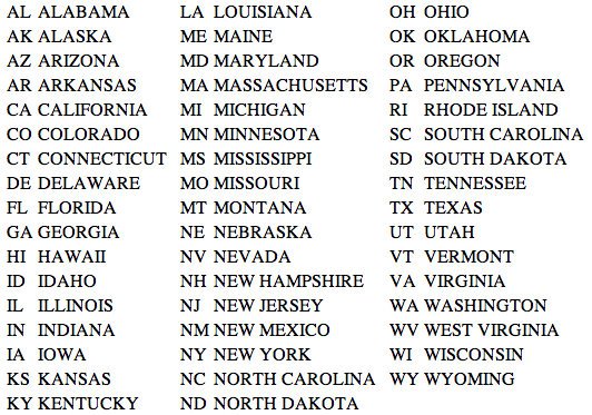
<t:newspaperTable newspaperColumns="3" value="#{addressBB.states}" var="state">
<f:facet name="spacer"><f:verbatim> </f:verbatim></f:facet>
<h:column>
<h:outputText value="#{state.abbr}"/>
</h:column>
<h:column>
<h:outputText value="#{state.name}"/>
</h:column>
</t:newspaperTable>Attributes
| Name | Type | Supports EL? | Description |
|---|---|---|---|
| align | String | Yes | HTML: Specifies the horizontal alignment of this element. Deprecated in HTML 4.01. |
| bgcolor | String | Yes | HTML: The background color of this element. |
| binding | org.apache.myfaces.custom.newspaper.HtmlNewspaperTable | Only EL | Identifies a backing bean property (of type UIComponent or appropriate subclass) to bind " + "to this component instance. This value must be an EL expression. |
| bodyrows | String | Yes | CSV of several row index to start (and end a previous) tbody element |
| border | int | Yes | HTML: Specifies the width of the border of this element, in pixels. Deprecated in HTML 4.01. |
| captionClass | String | Yes | A comma separated list of CSS class names to apply to all captions. If there are less classes than the number of rows, apply the same sequence of classes to the remaining captions, so the pattern is repeated. More than one class can be applied to a row by separating the classes with a space. |
| captionStyle | String | Yes | Gets The CSS class to be applied to the Caption. |
| cellpadding | String | Yes | HTML: Specifies the amount of empty space between the cell border and its contents. It can be either a pixel length or a percentage. |
| cellspacing | String | Yes | HTML: Specifies the amount of space between the cells of the table. It can be either a pixel length or a percentage of available space. |
| columnClasses | String | Yes | A comma separated list of CSS class names to apply to td elements in each column. |
| datafld | String | Yes | Reserved for future use. |
| dataformatas | String | Yes | Reserved for future use. |
| datasrc | String | Yes | Reserved for future use. |
| dir | String | Yes | HTML: The direction of text display, either 'ltr' (left-to-right) or 'rtl' (right-to-left). |
| first | int | Yes | Defines the index of the first row to be displayed, starting from 0. |
| footerClass | String | Yes | The CSS class to be applied to footer cells. |
| frame | String | Yes | HTML: Controls what part of the frame that surrounds a table is visible. Values include: void, above, below, hsides, lhs, rhs, vsides, box, and border. |
| headerClass | String | Yes | The CSS class to be applied to header cells. |
| id | String | Yes | Get a string which uniquely identifies this UIComponent within the scope of the nearest ancestor NamingContainer component. The id is not necessarily unique across all components in the current view. |
| lang | String | Yes | HTML: The base language of this document. |
| newspaperColumns | int | Yes | Set the number of columns the table will be divided over. In other words, the number of columns to wrap the table over. Default: 1 |
| newspaperOrientation | String | Yes | The orientation of the newspaper columns in the newspaper table - "horizontal" or "vertical". Default: vertical |
| onclick | String | Yes | HTML: Script to be invoked when the element is clicked. |
| ondblclick | String | Yes | HTML: Script to be invoked when the element is double-clicked. |
| onkeydown | String | Yes | HTML: Script to be invoked when a key is pressed down over this element. |
| onkeypress | String | Yes | HTML: Script to be invoked when a key is pressed over this element. |
| onkeyup | String | Yes | HTML: Script to be invoked when a key is released over this element. |
| onmousedown | String | Yes | HTML: Script to be invoked when the pointing device is pressed over this element. |
| onmousemove | String | Yes | HTML: Script to be invoked when the pointing device is moved while it is in this element. |
| onmouseout | String | Yes | HTML: Script to be invoked when the pointing device is moves out of this element. |
| onmouseover | String | Yes | HTML: Script to be invoked when the pointing device is moved into this element. |
| onmouseup | String | Yes | HTML: Script to be invoked when the pointing device is released over this element. |
| rendered | boolean | Yes | A boolean value that indicates whether this component should be rendered. Default value: true. |
| rowClasses | String | Yes | A comma separated list of CSS class names to apply to td elements in each row. |
| rows | int | Yes | Defines the maximum number of rows of data to be displayed.
Specify zero to display all rows from the "first" row to the end of available data. |
| rules | String | Yes | HTML: Controls how rules are rendered between cells. Values include: none, groups, rows, cols, and all. |
| style | String | Yes | HTML: CSS styling instructions. |
| styleClass | String | Yes | The CSS class for this element. Corresponds to the HTML 'class' attribute. |
| summary | String | Yes | HTML: Provides a summary of the contents of the table, for accessibility purposes. |
| title | String | Yes | HTML: An advisory title for this element. Often used by the user agent as a tooltip. |
| value | Object | Yes | An EL expression that specifies the data model that backs this table.
The value referenced by the EL expression can be of any type.
Note in particular that unordered collections, eg Set are not supported. Therefore if the value expression references such an object then the table will be considered to contain just one element - the collection itself. |
| var | String | No | Defines the name of the request-scope variable that will hold the current row during iteration.
During rendering of child components of this UIData, the variable with this name can be read to learn what the "rowData" object for the row currently being rendered is. This value must be a static value, ie an EL expression is not permitted. |
| width | String | Yes | HTML: Specifies the desired width of the table, as a pixel length or a percentage of available space. |