

Summary
Tag name: <t:inputCalendar>
UIComponent class: org.apache.myfaces.custom.calendar.HtmlInputCalendar
Tag class: org.apache.myfaces.custom.calendar.HtmlInputCalendarTag
Component type: org.apache.myfaces.HtmlInputCalendar
Component family: javax.faces.Input
Renderer type: org.apache.myfaces.Calendar
Renderer class: org.apache.myfaces.custom.calendar.HtmlCalendarRenderer
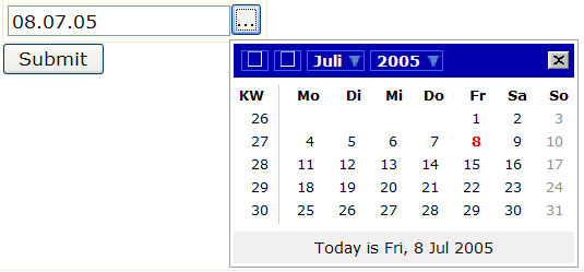
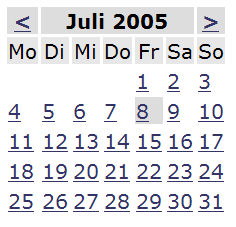
Provides a calendar. The calendar can be "inline", or a button can be rendered that displays the calendar in a "popup window" when clicked. Javascript is required for the popup window.
The two forms of calendar are unfortunately not well integrated; this component is effectively two components that happen to use the same component class. Some attributes on the component are applicable only to the inline form while others are applicable only to the popup form.
The appearance of the inline calendar can be controlled via attributes such as currentDayCellClass, dayCellClass, weekRowClass, monthYearRowClass. Attributes "styleLocation", "javascriptLocation", "imageLocation" and all attributes starting with "popup" have no effect on an inline calendar.
- popupTheme: When styleLocation is not overridden then this selects one of the built-in themes ("WH" or "DB"); the default is "DB". This also selects the prefix used for the names of style classes attached to generated dom elements; all style names are of form "jscalendar-{popupTheme}-*".
- styleLocation: specifies the URL of a directory in which a "theme.css" file exists. A reference to this theme.css file will automatically be output. Specifying "none" as the location prevents the generation of this stylesheet reference; it is assumed that the necessary style rules will be loaded via some other mechanism. Defaults to a reference to a location within the tomahawk jarfile which varies based on popupTheme.
- javascriptLocation: specifies the URL of a directory in which all the necessary script files can be found. A reference to scripts "prototype.js", "date.js" and "popcalendar.js" will automatically be output. Specifying "none" prevents generation of these references; it is assumed that the necessary javascript functions will be loaded via some other mechanism. Defaults to a reference to a location within the tomahawk jarfile.
- imageLocation: specifies the URL of a directory in which all the necessary icons are defined. Defaults to a reference to a location within the tomahawk jarfile which varies depending on popupTheme.
The appearance of the popup calendar can be controlled via attributes popupTheme, styleLocation, javascriptLocation and imageLocation:
Unless otherwise specified, all attributes accept static values or EL expressions.
Usage
<t:inputCalendar [ HTML universal attributes ]
               [ HTML event handler attributes ]
               [ UIInput standard attributes (i.e. valueChangeListener) ]
               [monthYearRowClass="month-and-year-header-row-css-class"]
               [weekRowClass="week-header-row-css-class"]
               [dayCellClass="empty-or-date-cell-css-class"]
               [currentDayCellClass="currently-selected-day-cell-css-class"]>
</t:inputCalendar>
Instructions
Standard core tags (i.e. a new Converter can be set for value-bindings to values other than java.util.Date).
see examples/calendar.jsp for an example!
Attributes
| Name | Type | Supports EL? | Description |
|---|---|---|---|
| accesskey | String | Yes | HTML: Sets the access key for this element. |
| addResources | boolean | Yes | Automatically add the input-calendar scripts and css files to the header - set that to false to provide the scripts yourself. |
| align | String | Yes | HTML: Specifies the horizontal alignment of this element. Deprecated in HTML 4.01. |
| alt | String | Yes | HTML: Specifies alternative text that can be used by a browser that can't show this element. |
| autocomplete | String | Yes | Non HTML standard attribute to disable browser's autocomplete function. |
| binding | org.apache.myfaces.custom.calendar.HtmlInputCalendar | Only EL | Identifies a backing bean property (of type UIComponent or appropriate subclass) to bind " + "to this component instance. This value must be an EL expression. |
| converter | javax.faces.convert.Converter | Yes | An expression that specifies the Converter for this component.
The value can either be a static value (ID) or an EL expression. When a static id is specified, an instance of the converter type registered with that id is used. When this is an EL expression, the result of evaluating the expression must be an object that implements the Converter interface. |
| converterMessage | String | Yes | Text to be displayed to the user as an error message when conversion of a submitted value to the target type
fails.
|
| currentDayCellClass | String | Yes | CSS class to be used for the TD element of the currently selected date. |
| datafld | String | Yes | Reserved for future use. |
| dataformatas | String | Yes | Reserved for future use. |
| datasrc | String | Yes | Reserved for future use. |
| dateBusinessConverter | org.apache.myfaces.custom.calendar.DateBusinessConverter | Yes | Indicate an object used as a bridge between the java.util.Date instance
used by this component internally and the value object used on the bean,
referred as a "business" value.
|
| dayCellClass | String | Yes | CSS class to be used for the TD element containing a day days. |
| dir | String | Yes | HTML: The direction of text display, either 'ltr' (left-to-right) or 'rtl' (right-to-left). |
| disabled | boolean | Yes | HTML: When true, this element cannot receive focus. |
| disabledOnClientSide | boolean | Yes | If true the input is rendered disabled on the client side and a hidden input is used to actualy submit his value back to the server. |
| displayValueOnly | Boolean | Yes | If true, renders only the value of the component, but no input widget. Default is false. |
| displayValueOnlyStyle | String | Yes | Style used when displayValueOnly is true. |
| displayValueOnlyStyleClass | String | Yes | Style class used when displayValueOnly is true. |
| enabledOnUserRole | String | Yes | If user is in given role, this component will be rendered normally. If not, no hyperlink is rendered but all nested tags (=body) are rendered. |
| forceId | boolean | No | If true, this component will force the use of the specified id when rendering. |
| forceIdIndex | boolean | No | If false, this component will not append a '[n]' suffix (where 'n' is the row index) to components that are contained within a "list." This value will be true by default and the value will be ignored if the value of forceId is false (or not specified.) |
| helpText | String | Yes | The text that will be rendered in the field - helping the user to find the right format to enter into the field. |
| id | String | Yes | Get a string which uniquely identifies this UIComponent within the scope of the nearest ancestor NamingContainer component. The id is not necessarily unique across all components in the current view. |
| imageLibrary | String | Yes | |
| imageLocation | String | Yes | An alternate location to find image resources. If no values is specified, images will be loaded from the resources directory using AddResource and ExtensionsFilter. |
| immediate | boolean | Yes | A boolean value that identifies the phase during which action events should fire.
During normal event processing, action methods and action listener methods are fired during the "invoke application" phase of request processing. If this attribute is set to "true", these methods are fired instead at the end of the "apply request values" phase. |
| javascriptLibrary | String | Yes | |
| javascriptLocation | String | Yes | An alternate location to find javascript resources. If no values is specified, javascript will be loaded from the resources directory using AddResource and ExtensionsFilter. |
| label | String | Yes | A display name for this component. |
| lang | String | Yes | HTML: The base language of this document. |
| maxlength | int | Yes | HTML: The maximum number of characters allowed to be entered. |
| monthYearRowClass | String | Yes | CSS class to be used on the TR element for the header-row showing month and year. |
| onblur | String | Yes | HTML: Specifies a script to be invoked when the element loses focus. |
| onchange | String | Yes | HTML: Specifies a script to be invoked when the element is modified. |
| onclick | String | Yes | HTML: Script to be invoked when the element is clicked. |
| ondblclick | String | Yes | HTML: Script to be invoked when the element is double-clicked. |
| onfocus | String | Yes | HTML: Specifies a script to be invoked when the element receives focus. |
| onkeydown | String | Yes | HTML: Script to be invoked when a key is pressed down over this element. |
| onkeypress | String | Yes | HTML: Script to be invoked when a key is pressed over this element. |
| onkeyup | String | Yes | HTML: Script to be invoked when a key is released over this element. |
| onmousedown | String | Yes | HTML: Script to be invoked when the pointing device is pressed over this element. |
| onmousemove | String | Yes | HTML: Script to be invoked when the pointing device is moved while it is in this element. |
| onmouseout | String | Yes | HTML: Script to be invoked when the pointing device is moves out of this element. |
| onmouseover | String | Yes | HTML: Script to be invoked when the pointing device is moved into this element. |
| onmouseup | String | Yes | HTML: Script to be invoked when the pointing device is released over this element. |
| onselect | String | Yes | HTML: Specifies a script to be invoked when the element is selected. |
| popupButtonImageUrl | String | Yes | Url to the image for this popupButton. |
| popupButtonString | String | Yes | Defines the string displayed on the button which leads to the calendar-popup-window (... by default). |
| popupButtonStyle | String | Yes | Defines the css style for the button which leads to the calendar-popup-window. |
| popupButtonStyleClass | String | Yes | Defines the css style class for the button which leads to the calendar-popup-window. |
| popupDateFormat | String | Yes | Defines the date format used by the java-script popup on client. |
| popupGotoString | String | Yes | Set the string for "Go To Current Month" |
| popupLeft | boolean | Yes | Render the input-calendar left of the button, not right like normally done. |
| popupScrollLeftMessage | String | Yes | Set the string for scrolling to the left. |
| popupScrollRightMessage | String | Yes | Set the string for scrolling to the right. |
| popupSelectDateMessage | String | Yes | Set the string for "Select [date] as date" (do not replace [date], it will be replaced by the current date). |
| popupSelectMode | String | Yes | May be "day", "week", "month" or "none":
|
| popupSelectMonthMessage | String | Yes | Set the string for "Click to select a month". |
| popupSelectYearMessage | String | Yes | Set the string for "Click to select a year". |
| popupTheme | String | Yes | Set the theme-prefix for this component. |
| popupTodayDateFormat | String | Yes | Defines the date format used by the java-script popup on client for the today-is string. |
| popupTodayString | String | Yes | Set the string for "Today is" |
| popupWeekString | String | Yes | Set the string for "Wk" |
| readonly | boolean | Yes | HTML: When true, indicates that this component cannot be modified by the user. The element may receive focus unless it has also been disabled. |
| renderAsPopup | boolean | Yes | Render the input-calendar as a java-script popup on client. |
| renderPopupButtonAsImage | boolean | Yes | If true, renders a calendar icon instead of the button to pop up the calendar. |
| rendered | boolean | Yes | A boolean value that indicates whether this component should be rendered. Default value: true. |
| required | boolean | Yes | A boolean value that indicates whether an input value is required.
If this value is true and no input value is provided by a postback operation, then the "requiredMessage" text is registered as a FacesMessage for the request, and validation fails. Default value: false. |
| requiredMessage | String | Yes | Text to be displayed to the user as an error message when this component is marked as "required" but no input data is present during a postback (ie the user left the required field blank). |
| size | int | Yes | HTML: The initial width of this control, in characters. |
| style | String | Yes | HTML: CSS styling instructions. |
| styleClass | String | Yes | The CSS class for this element. Corresponds to the HTML 'class' attribute. |
| styleLibrary | String | Yes | |
| styleLocation | String | Yes | An alternate location to find stylesheet resources. If no values is specified, stylesheets will be loaded from the resources directory using AddResource and ExtensionsFilter. |
| tabindex | String | Yes | HTML: Specifies the position of this element within the tab order of the document. |
| title | String | Yes | HTML: An advisory title for this element. Often used by the user agent as a tooltip. |
| validator | javax.faces.el.MethodBinding | Only EL | A method-binding EL expression which is invoked during the validation phase for this component.
The invoked method is expected to check the submitted value for this component, and if not acceptable then report a validation error for the component. The method is expected to have the prototype public void aMethod(FacesContext, UIComponent,Object) |
| validatorMessage | String | Yes | Text which will be shown if validation fails. |
| value | Object | Yes | Gets The initial value of this component. |
| valueChangeListener | javax.faces.el.MethodBinding | Only EL | A method which is invoked during postback processing for the current view if the submitted value for this
component is not equal to the value which the "value" expression for this component returns.
The phase in which this method is invoked can be controlled via the immediate attribute. |
| visibleOnUserRole | String | Yes | If user is in given role, this component will be rendered normally. If not, nothing is rendered and the body of this tag will be skipped. |
| weekRowClass | String | Yes | CSS class to be used on the TR element for the header-row showing the week-days. |