

Summary
Tag name: <t:dataTable>
UIComponent class: org.apache.myfaces.component.html.ext.HtmlDataTable
Tag class: org.apache.myfaces.generated.taglib.html.ext.HtmlDataTableTag
Component type: org.apache.myfaces.HtmlDataTable
Component family: javax.faces.Data
Renderer type: org.apache.myfaces.Table
Renderer class: org.apache.myfaces.renderkit.html.ext.HtmlTableRenderer
The MyFacesDataTable extends the standard JSF DataTable by two
important features:
- Possiblity to save the state of the DataModel.
- Support for clickable sort headers (see SortHeader component).
Extended data_table that adds some additional features to the standard data_table action: see attribute descriptions for preserveDataModel, sortColumn, sortAscending and preserveSort.
Unless otherwise specified, all attributes accept static values or EL expressions.
Usage
<t:dataTable [ all standard dataTable attributes allowed ]
                [ preserveDataModel="{true|false}" ]
                [ preserveRowStates="{true|false}" ]
                [ forceIdIndexFormula="value-binding" ]
                [ sortColumn="value-binding" ]
                [ sortAscending="value-binding" ]
                [ preserveSort="{true|false}" ]
                [ renderedIfEmpty="{true|false}" ]
                [ rowIndexVar="variable name" ]
                [ rowCountVar="variable name" ]
                [ previousRowDataVar="variable name" ]
                [ rowId="value-binding" ]
                [ newspaperColumns="value-binding" ]
                [ newspaperOrientation="value-binding" ]
                [ rowStyleClass="css styleclass" ]
                [ rowStyle="inline css style" ]
                [ rowOnClick="javascript" ]
                [ rowOnDblClick="javascript" ]
                [ rowOnMouseDown="javascript" ]
                [ rowOnMouseUp="javascript" ]
                [ rowOnMouseOver="javascript" ]
                [ rowOnMouseMove="javascript" ]
                [ rowOnMouseOut="javascript" ]
                [ rowOnKeyPress="javascript" ]
                [ rowOnKeyDown="javascript" ]
                [ rowOnKeyUp="javascript" ]>
    standard dataTable body (<h:column> tags
    and optional "header", "footer", and "spacer" facets)
    <t:column>
    <t:columns>
    <t:command_sortheader/> inside column header or footer
<t:dataTable>
Instructions
Saving the state of the DataModel - the preserveDataModel attributeWhen this attribute is "true", the data behind the current DataModel is saved after the render response phase and restored in the restore component tree phase.
Why and when use this feature?Whenever you use a DataModel backed by a database connection you could run into problems, when the data in the database has changed since the last request. All Lifecycle phases prior to the render response phase iterate the DataModel and assume that the DataModel is unchanged since the last request. At least the row count must not have changed, because all children of UIData that are bound to the DataModel rely on it. But even if you can assure that row count never changes, a change in the data can have unintentional sideeffects.
Using the preserveDataModel feature prevents such problems. The DataModel (to be more exact: the currently visible part of the DataModel given by the first and the rows attribute) is freezed right after rendering and you can be sure that all lifecycle actions during the next request happen on exactly the same data.
What data types are supported?To be able to save the state of the DataModel the row objects must be serializable. All standard DataModel types are supported, except ResultSet, which will follow in one of the next releases,
Is updating the model supported?Yes. Just make your bean property that is bound to the DataTable component writable, i.e. give it a setter method.
Attention: To minimize the effort for saving the state of the DataModel only the visible rows are saved and restored. During the update model phase the setter will be called with an Array or List, that contains only these restored rows.
Wrapping table layout -- the newspaperColumns attribute and spacer facetThe newspaperColumns attribute allows a long, narrow table to be wrapped so that it becomes a short, wide table. This allows more information to be shown on a single screen. This is commonly used to present checkboxes for a long list of items. Use the "spacer" facet to specify a component displayed between layout columns. The newspaperOrientation attribute specifies if the columns will be layed out in a vertical or horizontal manner,
<t:dataTable newspaperColumns="3" value="#{addressBB.states}" newspaperOrientation="horizontal" var="state">
<f:facet name="spacer">
<f:verbatim>&#160;</f:verbatim>
</f:facet>
<h:column>
<h:outputText value="#{state.abbr}"/>
</h:column>
<h:column>
<h:outputText value="#{state.name}"/>
</h:column>
</t:dataTable>Displaying Details -- detailStamp facet
You can configure the Table to display or hide additional details of a particular row in response to a user gesture. This is done using "detailStamp" facet and varDetailToggle variable.
<t:dataTable ... varDetailToggler="detailToggler">
    ....
    <h:column>
        <h:commandLink rendered="#{detailToggler.currentDetailExpanded}" action="#{detailToggler.toggleDetail}">
            <h:outputText value="Hide"/>
        </h:commandLink>
        <h:commandLink rendered="#{!detailToggler.currentDetailExpanded}" action="#{detailToggler.toggleDetail}">
            <h:outputText value="Show"/>
        </h:commandLink>
    </h:column>
</t:dataTable>
In the example there is one column with two links that are rendered if the detail is expanded or not, and they just has a JSF action to activate the toggle. When a toggle is activated, the details for that row are displayed. When a toggle is deactivated, the details for the row are hidden. The user can also display or hide the details for all rows at the same time.
The following methods are available to call from varDetailToggle variable:
public void collapseAllDetails()
      public void expandAllDetails()
      public boolean isCurrentDetailExpanded()
      public boolean isDetailExpanded()
      public boolean isExpandedEmpty()
      public void toggleDetail()
Working with a changing data - the forceIdIndexFormula attribute
The default table assumes that your backing data collection is stable between 2 requests. This assumption can be false in several cases: concurrent accesses, unstable backing data collection order, ... If you have components within that table that update your data, you will get unintended behaviors.
This attribute is meant to fix that problem.
The table's components and the backing data objects are linked by the table's components' ids. By default the changing part of those ids is the row number. So if the backing data positions in the list is changed between the 2 requests (like an element inserted in the head of the list), you will update the wrong element in the backing data's collection.
To fix this, you can set the forceIdIndexFormula to an EL that will be unique and stable for each row. That way, even if your backing data list changes between 2 requests, you always update the intended element in the list.
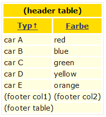
Supported Facets
| Name | Required | Description |
|---|---|---|
| detailStamp | false | This facet renders an additional row after or before (according to detailStampLocation value) the current row, usually containing additional information of the related row. It is toggled usually using varDetailToggle variable and the method toggleDetail(). |
| footer | false | |
| header | false | |
| spacer | false | Gets the spacer facet, between each pair of newspaper columns. |
Attributes
| Name | Type | Supports EL? | Description |
|---|---|---|---|
| ajaxRowRender | boolean | Yes | Indicate if "row" can be a target for an ajax render operation. In other words, if it is set to true, a special component is added on a facet with name "row" and with id="row" that can be used to indicate it is necessary to render the row. By default is set to false. |
| align | String | Yes | HTML: Specifies the horizontal alignment of this element. Deprecated in HTML 4.01. |
| bgcolor | String | Yes | HTML: The background color of this element. |
| binding | org.apache.myfaces.component.html.ext.HtmlDataTable | Only EL | Identifies a backing bean property (of type UIComponent or appropriate subclass) to bind " + "to this component instance. This value must be an EL expression. |
| bodyStyle | String | Yes | Corresponds to the HTML style attribute for the table body tag |
| bodyStyleClass | String | Yes | Corresponds to the HTML class attribute for the table body tag. |
| bodyrows | String | Yes | CSV of several row index to start (and end a previous) tbody element |
| border | int | Yes | HTML: Specifies the width of the border of this element, in pixels. Deprecated in HTML 4.01. |
| captionClass | String | Yes | A comma separated list of CSS class names to apply to all captions. If there are less classes than the number of rows, apply the same sequence of classes to the remaining captions, so the pattern is repeated. More than one class can be applied to a row by separating the classes with a space. |
| captionStyle | String | Yes | Gets The CSS class to be applied to the Caption. |
| cellpadding | String | Yes | HTML: Specifies the amount of empty space between the cell border and its contents. It can be either a pixel length or a percentage. |
| cellspacing | String | Yes | HTML: Specifies the amount of space between the cells of the table. It can be either a pixel length or a percentage of available space. |
| columnClasses | String | Yes | A comma separated list of CSS class names to apply to td elements in each column. |
| datafld | String | Yes | Reserved for future use. |
| dataformatas | String | Yes | Reserved for future use. |
| datasrc | String | Yes | Reserved for future use. |
| derivedRowKeyPrefix | String | Yes | This attribute is used to append an unique prefix when rowKey is not used, to prevent a key match a existing component id (note two different components can't have the same unique id). |
| detailStampExpandedDefault | boolean | Yes | true|false - true if the detailStamp should be expanded by default. default: false |
| detailStampLocation | String | Yes | before|after - where to render the detailStamp, before the actual row or after it. default: after |
| dir | String | Yes | HTML: The direction of text display, either 'ltr' (left-to-right) or 'rtl' (right-to-left). |
| embedded | boolean | Yes | Avoids rendering the html table tags, thus, giving you a table rendering just rows. You can use this together with the detailStamp faces of the parent datatable to render child-tables using the same layout as the parent. Notice: You have to ensure both tables do have the same number of columns. Using the colspan attribute of the column tag might help alot. |
| enabledOnUserRole | String | Yes | If user is in given role, this component will be rendered normally. If not, no hyperlink is rendered but all nested tags (=body) are rendered. |
| first | int | Yes | The index of the first row to be displayed, where 0 is the first row. |
| footerClass | String | Yes | The CSS class to be applied to footer cells. |
| forceId | boolean | No | If true, this component will force the use of the specified id when rendering. |
| forceIdIndex | boolean | No | If false, this component will not append a '[n]' suffix (where 'n' is the row index) to components that are contained within a "list." This value will be true by default and the value will be ignored if the value of forceId is false (or not specified.) |
| forceIdIndexFormula | String | Yes | A formula that overrides the default row index in the construction of table's body components. Example : #{myRowVar.key} Warning, the EL should evaluate to a unique value for each row ! |
| frame | String | Yes | HTML: Controls what part of the frame that surrounds a table is visible. Values include: void, above, below, hsides, lhs, rhs, vsides, box, and border. |
| headerClass | String | Yes | The CSS class to be applied to header cells. |
| id | String | Yes | Get a string which uniquely identifies this UIComponent within the scope of the nearest ancestor NamingContainer component. The id is not necessarily unique across all components in the current view. |
| lang | String | Yes | HTML: The base language of this document. |
| newspaperColumns | int | Yes | The number of columns to wrap the table over. Default: 1 Set the number of columns the table will be divided over. |
| newspaperOrientation | String | Yes | The orientation of the newspaper columns in the newspaper table - "horizontal" or "vertical". Default: vertical |
| onclick | String | Yes | HTML: Script to be invoked when the element is clicked. |
| ondblclick | String | Yes | HTML: Script to be invoked when the element is double-clicked. |
| onkeydown | String | Yes | HTML: Script to be invoked when a key is pressed down over this element. |
| onkeypress | String | Yes | HTML: Script to be invoked when a key is pressed over this element. |
| onkeyup | String | Yes | HTML: Script to be invoked when a key is released over this element. |
| onmousedown | String | Yes | HTML: Script to be invoked when the pointing device is pressed over this element. |
| onmousemove | String | Yes | HTML: Script to be invoked when the pointing device is moved while it is in this element. |
| onmouseout | String | Yes | HTML: Script to be invoked when the pointing device is moves out of this element. |
| onmouseover | String | Yes | HTML: Script to be invoked when the pointing device is moved into this element. |
| onmouseup | String | Yes | HTML: Script to be invoked when the pointing device is released over this element. |
| preserveDataModel | boolean | Yes | Indicates whether the state of the whole DataModel should be saved and restored. When set to false, the value-binding for the "value" attribute of this table is executed each time the page is rendered. When set to true, that value-binding is only executed when the component is first created, and the DataModel state is thereafter saved/restored automatically by the component. When column sorting is used for a table this property needs to be false so that the DataModel can be updated to reflect any changes in the sort criteria. Default: false |
| preserveRowComponentState | boolean | No | Indicates whether the state for a component in each row should not be discarded before the datatable is rendered again. This property is similar to tomahawk t:dataTable preserveRowStates This will only work reliable if the datamodel of the datatable did not change either by sorting, removing or adding rows. Default: false |
| preserveRowStates | boolean | Yes | Indicates whether the state for each row should not be discarded before the datatable is rendered again. Setting this to true might be hepful if an input component inside the datatable has no valuebinding and the value entered in there should be displayed again. This will only work reliable if the datamodel of the datatable did not change either by sorting, removing or adding rows. Default: false |
| preserveSort | boolean | Yes | Indicates whether the state of the sortColumn and sortAscending attribute should be saved and restored and written back to the model during the update model phase. Default: true |
| previousRowDataVar | String | Yes | A parameter name, under which the previous RowData Object is set in request scope similar to the rowIndexVar and rowCountVar parameters. Mind that the value of this request scope attribute is null in the first row or when isRowAvailable returns false for the previous row. |
| rendered | boolean | Yes | A boolean value that indicates whether this component should be rendered. Default value: true. |
| renderedIfEmpty | boolean | Yes | Indicates whether this table should be rendered if the underlying DataModel is empty. You could as well use rendered="#{not empty bean.list}", but this one causes the getList method of your model bean beeing called up to five times per request, which is not optimal when the list is backed by a DB table. Using renderedIfEmpty="false" solves this problem, because the MyFaces extended HtmlDataTable automatically caches the DataModel and calles the model getter only once per request. Default: true |
| rowClasses | String | Yes | A comma separated list of CSS class names to apply to td elements in each row. |
| rowCountVar | String | Yes | A parameter name, under which the rowCount is set in request scope similar to the var parameter. |
| rowGroupStyle | String | Yes | Corresponds to the HTML style attribute for grouped rows. |
| rowGroupStyleClass | String | Yes | StyleClass for grouped rows. |
| rowId | String | Yes | The id to use for |
| rowIndexVar | String | Yes | A parameter name, under which the current rowIndex is set in request scope similar to the var parameter. |
| rowKey | Object | Yes | Used to assign a value expression that identify in a unique way a row. This value will be used later instead of rowIndex as a key to be appended to the container client id using getDerivedSubClientId() method. |
| rowOnClick | String | Yes | Defines a JavaScript onclick event handler for each table row |
| rowOnDblClick | String | Yes | Defines a JavaScript ondblclick event handler for each table row |
| rowOnKeyDown | String | Yes | Defines a JavaScript onkeydown event handler for each table row |
| rowOnKeyPress | String | Yes | Defines a JavaScript onkeypress event handler for each table row |
| rowOnKeyUp | String | Yes | Defines a JavaScript onkeyup event handler for each table row |
| rowOnMouseDown | String | Yes | Defines a JavaScript onmpusedown event handler for each table row |
| rowOnMouseMove | String | Yes | Defines a JavaScript onmousemove event handler for each table row |
| rowOnMouseOut | String | Yes | Defines a JavaScript onmouseout event handler for each table row |
| rowOnMouseOver | String | Yes | Defines a JavaScript onmouseover event handler for each table row |
| rowOnMouseUp | String | Yes | Defines a JavaScript onmouseup event handler for each table row |
| rowStatePreserved | boolean | No | Indicates whether the state for a component in each row should not be discarded before the datatable is rendered again. In tomahawk, this property is the same as t:dataTable preserveRowComponentState This will only work reliable if the datamodel of the datatable did not change either by sorting, removing or adding rows. Default: false |
| rowStyle | String | Yes | Corresponds to the HTML style attribute for the row tr tag. |
| rowStyleClass | String | Yes | Corresponds to the HTML class attribute for the row tr tag. |
| rows | int | Yes | The number of rows to be displayed. Specify zero for all remaining rows in the table. |
| rules | String | Yes | HTML: Controls how rules are rendered between cells. Values include: none, groups, rows, cols, and all. |
| sortAscending | boolean | Yes | Value reference to a model property that gives the current sort direction. The target Boolean property is set to true when the selected sortColumn should be sorted in ascending order, and false otherwise. The method which is bound to the "value" attribute of this table (ie which provides the DataModel used) is expected to use this property to determine how to sort the DataModel's contents. |
| sortColumn | String | Yes | Value reference to a model property that gives the current sort column name. The target String property is set to the "columnName" of whichever column has been chosen to sort by, and the method which is bound to the "value" attribute of this table (ie which provides the DataModel used) is expected to use this property to determine how to sort the DataModel's contents. |
| sortable | boolean | Yes | Define if the table is sortable or not |
| sortedColumnVar | String | Yes | A parameter name, under which the a boolean is set in request scope similar to the var parameter. TRUE for the column that is currently sorted, FALSE otherwise. |
| style | String | Yes | HTML: CSS styling instructions. |
| styleClass | String | Yes | The CSS class for this element. Corresponds to the HTML 'class' attribute. |
| summary | String | Yes | HTML: Provides a summary of the contents of the table, for accessibility purposes. |
| title | String | Yes | HTML: An advisory title for this element. Often used by the user agent as a tooltip. |
| value | Object | Yes | An EL expression that specifies the data model that backs this table.
The value referenced by the EL expression can be of any type.
Note in particular that unordered collections, eg Set are not supported. Therefore if the value expression references such an object then the table will be considered to contain just one element - the collection itself. |
| valueType | String | Yes | Indicate the expected type of the EL expression pointed by value property. It is useful when vb.getType() cannot found the type, like when a map value is resolved on the expression. |
| var | String | No | Defines the name of the request-scope variable that will hold the current row during iteration.
During rendering of child components of this UIData, the variable with this name can be read to learn what the "rowData" object for the row currently being rendered is. This value must be a static value, ie an EL expression is not permitted. |
| varDetailToggler | String | Yes | This variable has the boolean property "currentdetailExpanded" which is true if the current detail row is expanded and the action method "toggleDetail" which expand/collapse the current detail row. |
| visibleOnUserRole | String | Yes | If user is in given role, this component will be rendered normally. If not, nothing is rendered and the body of this tag will be skipped. |
| width | String | Yes | HTML: Specifies the desired width of the table, as a pixel length or a percentage of available space. |