

Summary
Tag name: <t:panelTabbedPane>
UIComponent class: org.apache.myfaces.custom.tabbedpane.HtmlPanelTabbedPane
Tag class: org.apache.myfaces.custom.tabbedpane.HtmlPanelTabbedPaneTag
Component type: org.apache.myfaces.HtmlPanelTabbedPane
Component family: javax.faces.Panel
Renderer type: org.apache.myfaces.TabbedPane
Renderer class: org.apache.myfaces.custom.tabbedpane.HtmlTabbedPaneRenderer
TODO: Document this component.
Unless otherwise specified, all attributes accept static values or EL expressions.
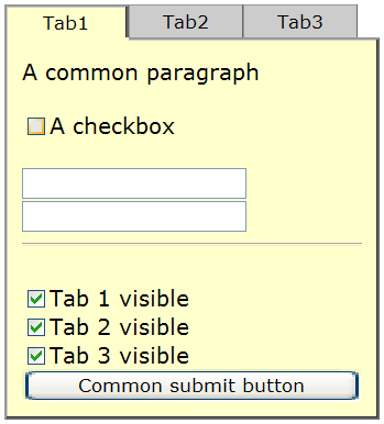
Usage
<t:panelTabbedPane selectedIndex="int"
                      activeTabStyleClass="CSSClass"
                      inactiveTabStyleClass="CSSClass"
                      disabledTabStyleClass="CSSClass"
                      activeSubStyleClass="CSSClass"
                      inactiveSubStyleClass="CSSClass"
                      tabContentStyleClass="CSSClass">
    <t:panelTab ...>
        ...(anyComponents)...
    </t:panelTab>
</t:panelTabbedPane>Attributes
| Name | Type | Supports EL? | Description |
|---|---|---|---|
| activePanelTabVar | Boolean | Yes | Boolean Variable that is set in request scope when rendering a panelTab. True means that the currently rendered panelTab is active. |
| activeSubStyleClass | String | Yes | Style class of the active tab sub cell. |
| activeTabStyleClass | String | Yes | Style class of the active tab cell. |
| align | String | Yes | HTML: Specifies the horizontal alignment of this element. Deprecated in HTML 4.01. |
| bgcolor | String | Yes | HTML: The background color of this element. |
| binding | String | Only EL | Identifies a backing bean property (of type UIComponent or appropriate subclass) to bind to this component instance. This value must be an EL expression. |
| border | int | Yes | HTML: Specifies the width of the border of this element, in pixels. Deprecated in HTML 4.01. |
| cellpadding | String | Yes | HTML: Specifies the amount of empty space between the cell border and its contents. It can be either a pixel length or a percentage. |
| cellspacing | String | Yes | HTML: Specifies the amount of space between the cells of the table. It can be either a pixel length or a percentage of available space. |
| datafld | String | Yes | Reserved for future use. |
| dataformatas | String | Yes | Reserved for future use. |
| datasrc | String | Yes | Reserved for future use. |
| dir | String | Yes | HTML: The direction of text display, either 'ltr' (left-to-right) or 'rtl' (right-to-left). |
| disabledTabStyleClass | String | Yes | Style class of the disabled tab cells. |
| enabledOnUserRole | String | Yes | If user is in given role, this component will be rendered normally. If not, no hyperlink is rendered but all nested tags (=body) are rendered. |
| frame | String | Yes | HTML: Controls what part of the frame that surrounds a table is visible. Values include: void, above, below, hsides, lhs, rhs, vsides, box, and border. |
| id | String | Yes | An identifier for this particular component instance within
a component view.
The id must be unique within the scope of the tag's enclosing NamingContainer (eg h:form or f:subview). The id is not necessarily unique across all components in the current view This value must be a static value, ie not change over the lifetime of a component. It cannot be defined via an EL expression; only a string is permitted. |
| immediateTabChange | boolean | Yes | Define if the process validation and update model phases should be executed before change between tabs, when serverSideTabSwitch = true (if is false, the switch is done by other way so this property does not have any effect). Note that if this property is set as false, only a tab change is done if all input fields inside the form are valid (including input components outside this panel). By default is true, so both phases are not executed. |
| inactiveSubStyleClass | String | Yes | Style class of the inactive tab sub cells. |
| inactiveTabStyleClass | String | Yes | Style class of the inactive tab cells. |
| lang | String | Yes | HTML: The base language of this document. |
| onclick | String | Yes | HTML: Script to be invoked when the element is clicked. |
| ondblclick | String | Yes | HTML: Script to be invoked when the element is double-clicked. |
| onkeydown | String | Yes | HTML: Script to be invoked when a key is pressed down over this element. |
| onkeypress | String | Yes | HTML: Script to be invoked when a key is pressed over this element. |
| onkeyup | String | Yes | HTML: Script to be invoked when a key is released over this element. |
| onmousedown | String | Yes | HTML: Script to be invoked when the pointing device is pressed over this element. |
| onmousemove | String | Yes | HTML: Script to be invoked when the pointing device is moved while it is in this element. |
| onmouseout | String | Yes | HTML: Script to be invoked when the pointing device is moves out of this element. |
| onmouseover | String | Yes | HTML: Script to be invoked when the pointing device is moved into this element. |
| onmouseup | String | Yes | HTML: Script to be invoked when the pointing device is released over this element. |
| rendered | boolean | Yes | A boolean value that indicates whether this component should be rendered. Default value: true. |
| rules | String | Yes | HTML: Controls how rules are rendered between cells. Values include: none, groups, rows, cols, and all. |
| selectedIndex | int | Yes | Index of tab that is selected by default. |
| serverSideTabSwitch | boolean | Yes | Toggle client-side/server-side tab switches. |
| style | String | Yes | HTML: CSS styling instructions. |
| styleClass | String | Yes | The CSS class for this element. Corresponds to the HTML 'class' attribute. |
| summary | String | Yes | HTML: Provides a summary of the contents of the table, for accessibility purposes. |
| tabContentStyleClass | String | Yes | Style class of the active tab content cell. |
| title | String | Yes | HTML: An advisory title for this element. Often used by the user agent as a tooltip. |
| visibleOnUserRole | String | Yes | If user is in given role, this component will be rendered normally. If not, nothing is rendered and the body of this tag will be skipped. |
| width | String | Yes | HTML: Specifies the desired width of the table, as a pixel length or a percentage of available space. |