

Summary
Tag name: <t:panelNavigation2>
UIComponent class: org.apache.myfaces.custom.navmenu.htmlnavmenu.HtmlPanelNavigationMenu
Tag class: org.apache.myfaces.custom.navmenu.htmlnavmenu.HtmlPanelNavigationMenuTag
Component type: org.apache.myfaces.HtmlPanelNavigationMenu
Component family: javax.faces.Panel
Renderer type: org.apache.myfaces.NavigationMenu
Renderer class: org.apache.myfaces.custom.navmenu.htmlnavmenu.HtmlNavigationMenuRenderer
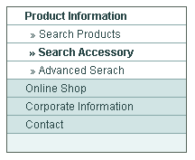
Renders a vertical menu structure with support for nested menu items.
The menu is rendered as unordered List. The menu-tree can be
dynamically build using NavigationMenuItem(s).
Unless otherwise specified, all attributes accept static values or EL expressions.
Many thanks to the guys from Swiss Federal Institute of Intellectual Property and Marc Bouquet
for helping to develop this component.
Usage
<t:panelNavigation2 [ standard HTML table attributes ]
                      [itemClass="normal-menu-item-css-class"]
                      [openItemClass="open-menu-item-css-class"]
                      [activeItemClass="active-menu-item-css-class"]
                      [separatorClass="separator-css-class"]
                      [itemStyle="normal-menu-item-css-style"]
                      [openItemStyle="open-menu-item-css-style"]
                      [activeItemStyle="active-menu-item-css-style"]
                      [separatorStyle="separator-css-style"]>
    Nested <t:commandNavigation2> tags (menu items) and output components
       <t:navigationMenuItem> tags (NavigationMenuItem)
       <t:navigationMenuItems> tags (NavigationMenuItem(s))
</t:panelNavigation>Attributes
| Name | Type | Supports EL? | Description |
|---|---|---|---|
| activeItemClass | String | Yes | The CSS class of open navigation items. |
| activeItemStyle | String | Yes | The CSS Style of the active navigation item. |
| align | String | Yes | HTML: Specifies the horizontal alignment of this element. Deprecated in HTML 4.01. |
| bgcolor | String | Yes | HTML: The background color of this element. |
| binding | String | Only EL | Identifies a backing bean property (of type UIComponent or appropriate subclass) to bind to this component instance. This value must be an EL expression. |
| border | int | Yes | HTML: Specifies the width of the border of this element, in pixels. Deprecated in HTML 4.01. |
| cellpadding | String | Yes | HTML: Specifies the amount of empty space between the cell border and its contents. It can be either a pixel length or a percentage. |
| cellspacing | String | Yes | HTML: Specifies the amount of space between the cells of the table. It can be either a pixel length or a percentage of available space. |
| colspan | int | Yes | standard html colspan attribute for table cell |
| datafld | String | Yes | Reserved for future use. |
| dataformatas | String | Yes | Reserved for future use. |
| datasrc | String | Yes | Reserved for future use. |
| dir | String | Yes | HTML: The direction of text display, either 'ltr' (left-to-right) or 'rtl' (right-to-left). |
| disabled | boolean | Yes | When set instead of a Hyperlink a span tag is rendered in the corresponding Component |
| disabledStyle | String | Yes | CSS-Style Attribute to render when disabled is true |
| disabledStyleClass | String | Yes | CSS-Style Class to use when disabled is true |
| displayValueOnly | Boolean | Yes | If true, renders only the value of the component, but no input widget. Default is false. |
| displayValueOnlyStyle | String | Yes | Style used when displayValueOnly is true. |
| displayValueOnlyStyleClass | String | Yes | Style class used when displayValueOnly is true. |
| enabledOnUserRole | String | Yes | If user is in given role, this component will be rendered normally. If not, no hyperlink is rendered but all nested tags (=body) are rendered. |
| expandAll | boolean | Yes | If set to true all Items are expanded from the beginning and never closed. |
| forceId | boolean | No | If true, this component will force the use of the specified id when rendering. |
| forceIdIndex | boolean | No | If false, this component will not append a '[n]' suffix (where 'n' is the row index) to components that are contained within a "list." This value will be true by default and the value will be ignored if the value of forceId is false (or not specified.) |
| frame | String | Yes | HTML: Controls what part of the frame that surrounds a table is visible. Values include: void, above, below, hsides, lhs, rhs, vsides, box, and border. |
| id | String | Yes | An identifier for this particular component instance within
a component view.
The id must be unique within the scope of the tag's enclosing NamingContainer (eg h:form or f:subview). The id is not necessarily unique across all components in the current view This value must be a static value, ie not change over the lifetime of a component. It cannot be defined via an EL expression; only a string is permitted. |
| itemClass | String | Yes | The CSS class of closed navigation items. |
| itemStyle | String | Yes | The CSS Style of closed navigation items. |
| lang | String | Yes | HTML: The base language of this document. |
| layout | String | Yes | 'table' or 'list' Layout (default is 'table') |
| onclick | String | Yes | HTML: Script to be invoked when the element is clicked. |
| ondblclick | String | Yes | HTML: Script to be invoked when the element is double-clicked. |
| onkeydown | String | Yes | HTML: Script to be invoked when a key is pressed down over this element. |
| onkeypress | String | Yes | HTML: Script to be invoked when a key is pressed over this element. |
| onkeyup | String | Yes | HTML: Script to be invoked when a key is released over this element. |
| onmousedown | String | Yes | HTML: Script to be invoked when the pointing device is pressed over this element. |
| onmousemove | String | Yes | HTML: Script to be invoked when the pointing device is moved while it is in this element. |
| onmouseout | String | Yes | HTML: Script to be invoked when the pointing device is moves out of this element. |
| onmouseover | String | Yes | HTML: Script to be invoked when the pointing device is moved into this element. |
| onmouseup | String | Yes | HTML: Script to be invoked when the pointing device is released over this element. |
| openItemClass | String | Yes | The CSS class of open navigation items. |
| openItemStyle | String | Yes | The CSS Style of open navigation items. |
| renderAll | boolean | Yes | If set to true all Items are rendered and other methods, like CSS should be used to hide them as necessary |
| rendered | boolean | Yes | A boolean value that indicates whether this component should be rendered. Default value: true. |
| rules | String | Yes | HTML: Controls how rules are rendered between cells. Values include: none, groups, rows, cols, and all. |
| separatorClass | String | Yes | The CSS class for the td element of a separator. |
| separatorStyle | String | Yes | The CSS Style for the td element of a separator. |
| style | String | Yes | HTML: CSS styling instructions. |
| styleClass | String | Yes | The CSS class for this element. Corresponds to the HTML 'class' attribute. |
| summary | String | Yes | HTML: Provides a summary of the contents of the table, for accessibility purposes. |
| title | String | Yes | HTML: An advisory title for this element. Often used by the user agent as a tooltip. |
| visibleOnUserRole | String | Yes | If user is in given role, this component will be rendered normally. If not, nothing is rendered and the body of this tag will be skipped. |
| width | String | Yes | HTML: Specifies the desired width of the table, as a pixel length or a percentage of available space. |