

Summary
Tag name: <t:panelNavigation>
UIComponent class: org.apache.myfaces.custom.navigation.HtmlPanelNavigation
Tag class: org.apache.myfaces.custom.navigation.HtmlPanelNavigationTag
Component type: org.apache.myfaces.HtmlPanelNavigation
Component family: javax.faces.Panel
Renderer type: org.apache.myfaces.Navigation
Renderer class: org.apache.myfaces.custom.navigation.HtmlNavigationRenderer
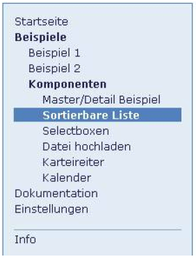
Renders a vertical menu structure with support for nested menu
items. Unless otherwise specified, all attributes accept
static values or EL expressions.
Panel, that includes navigation items ({@link HtmlCommandNavigation}) and other
components (separators).
Usage
<t:panelNavigation [ standard HTML table attributes ]
                      [itemClass="normal-menu-item-css-class"]
                      [openItemClass="open-menu-item-css-class"]
                      [activeItemClass="active-menu-item-css-class"]
                      [separatorClass="separator-css-class"]
                      [itemStyle="normal-menu-item-css-style"]
                      [openItemStyle="open-menu-item-css-style"]
                      [activeItemStyle="active-menu-item-css-style"]
                      [separatorStyle="separator-css-style"]>
    Nested <t:commandNavigation> tags (menu items) and output components (separat
</t:panelNavigation>
Instructions
Body content must be a combination of <t:commandNavigation> tags and standard output tags. Output tags are rendered as separators and can be used to divide the menu into sections.
Attributes
| Name | Type | Supports EL? | Description |
|---|---|---|---|
| activeItemClass | String | Yes | The CSS class of the active navigation item. |
| activeItemStyle | String | Yes | The CSS Style of the active navigation item. |
| align | String | Yes | HTML: Specifies the horizontal alignment of this element. Deprecated in HTML 4.01. |
| bgcolor | String | Yes | HTML: The background color of this element. |
| binding | String | Only EL | Identifies a backing bean property (of type UIComponent or appropriate subclass) to bind to this component instance. This value must be an EL expression. |
| border | int | Yes | HTML: Specifies the width of the border of this element, in pixels. Deprecated in HTML 4.01. |
| cellpadding | String | Yes | HTML: Specifies the amount of empty space between the cell border and its contents. It can be either a pixel length or a percentage. |
| cellspacing | String | Yes | HTML: Specifies the amount of space between the cells of the table. It can be either a pixel length or a percentage of available space. |
| colspan | int | Yes | standard html colspan attribute for table cell |
| datafld | String | Yes | Reserved for future use. |
| dataformatas | String | Yes | Reserved for future use. |
| datasrc | String | Yes | Reserved for future use. |
| dir | String | Yes | HTML: The direction of text display, either 'ltr' (left-to-right) or 'rtl' (right-to-left). |
| displayValueOnly | Boolean | Yes | If true, renders only the value of the component, but no input widget. Default is false. |
| displayValueOnlyStyle | String | Yes | Style used when displayValueOnly is true. |
| displayValueOnlyStyleClass | String | Yes | Style class used when displayValueOnly is true. |
| enabledOnUserRole | String | Yes | If user is in given role, this component will be rendered normally. If not, no hyperlink is rendered but all nested tags (=body) are rendered. |
| forceId | boolean | No | If true, this component will force the use of the specified id when rendering. |
| forceIdIndex | boolean | No | If false, this component will not append a '[n]' suffix (where 'n' is the row index) to components that are contained within a "list." This value will be true by default and the value will be ignored if the value of forceId is false (or not specified.) |
| frame | String | Yes | HTML: Controls what part of the frame that surrounds a table is visible. Values include: void, above, below, hsides, lhs, rhs, vsides, box, and border. |
| id | String | Yes | An identifier for this particular component instance within
a component view.
The id must be unique within the scope of the tag's enclosing NamingContainer (eg h:form or f:subview). The id is not necessarily unique across all components in the current view This value must be a static value, ie not change over the lifetime of a component. It cannot be defined via an EL expression; only a string is permitted. |
| itemClass | String | Yes | The CSS class of closed navigation items. |
| itemStyle | String | Yes | The CSS Style of closed navigation items. |
| lang | String | Yes | HTML: The base language of this document. |
| layout | String | Yes | Determines the type of layout that is used when rendering a panelGroup: when 'block' is specified, an HTML div is rendered instead of the default HTML span. |
| onclick | String | Yes | HTML: Script to be invoked when the element is clicked. |
| ondblclick | String | Yes | HTML: Script to be invoked when the element is double-clicked. |
| onkeydown | String | Yes | HTML: Script to be invoked when a key is pressed down over this element. |
| onkeypress | String | Yes | HTML: Script to be invoked when a key is pressed over this element. |
| onkeyup | String | Yes | HTML: Script to be invoked when a key is released over this element. |
| onmousedown | String | Yes | HTML: Script to be invoked when the pointing device is pressed over this element. |
| onmousemove | String | Yes | HTML: Script to be invoked when the pointing device is moved while it is in this element. |
| onmouseout | String | Yes | HTML: Script to be invoked when the pointing device is moves out of this element. |
| onmouseover | String | Yes | HTML: Script to be invoked when the pointing device is moved into this element. |
| onmouseup | String | Yes | HTML: Script to be invoked when the pointing device is released over this element. |
| openItemClass | String | Yes | The CSS class of open navigation items. |
| openItemStyle | String | Yes | The CSS Style of open navigation items. |
| rendered | boolean | Yes | A boolean value that indicates whether this component should be rendered. Default value: true. |
| rules | String | Yes | HTML: Controls how rules are rendered between cells. Values include: none, groups, rows, cols, and all. |
| separatorClass | String | Yes | The CSS class for the td element of a separator. |
| separatorStyle | String | Yes | The CSS Style for the td element of a separator. |
| style | String | Yes | HTML: CSS styling instructions. |
| styleClass | String | Yes | The CSS class for this element. Corresponds to the HTML 'class' attribute. |
| summary | String | Yes | HTML: Provides a summary of the contents of the table, for accessibility purposes. |
| title | String | Yes | HTML: An advisory title for this element. Often used by the user agent as a tooltip. |
| visibleOnUserRole | String | Yes | If user is in given role, this component will be rendered normally. If not, nothing is rendered and the body of this tag will be skipped. |
| width | String | Yes | HTML: Specifies the desired width of the table, as a pixel length or a percentage of available space. |