

Summary
Tag name: <t:dataList>
UIComponent class: org.apache.myfaces.custom.datalist.HtmlDataList
Tag class: org.apache.myfaces.custom.datalist.HtmlDataListTag
Component type: org.apache.myfaces.HtmlDataList
Component family: javax.faces.Data
Renderer type: org.apache.myfaces.List
Renderer class: org.apache.myfaces.custom.datalist.HtmlListRenderer
Similar to dataTable, but does not render a table.
Instead the layout attribute controls how each dataRow is rendered.
Unless otherwise specified, all attributes accept static values or EL expressions.
Usage
<t:dataList id="String"
               styleClass="CSSClass1"
               itemStyleClass="CSSClass2"
               var="String"
               value="List"
               layout="Constant"
               rowCountVar="int"
               rowIndexVar="int">
    <h:outputText .../>
</t:dataList>Attributes
| Name | Type | Supports EL? | Description |
|---|---|---|---|
| bgcolor | String | Yes | HTML: The background color of this element. |
| binding | String | Only EL | Identifies a backing bean property (of type UIComponent or appropriate subclass) to bind to this component instance. This value must be an EL expression. |
| border | int | Yes | HTML: Specifies the width of the border of this element, in pixels. Deprecated in HTML 4.01. |
| cellpadding | String | Yes | HTML: Specifies the amount of empty space between the cell border and its contents. It can be either a pixel length or a percentage. |
| cellspacing | String | Yes | HTML: Specifies the amount of space between the cells of the table. It can be either a pixel length or a percentage of available space. |
| columnClasses | String | Yes | A comma separated list of CSS class names to apply to td elements in each column. |
| derivedRowKeyPrefix | String | Yes | This attribute is used to append an unique prefix when rowKey is not used, to prevent a key match a existing component id (note two different components can't have the same unique id). |
| dir | String | Yes | HTML: The direction of text display, either 'ltr' (left-to-right) or 'rtl' (right-to-left). |
| enabledOnUserRole | String | Yes | If user is in given role, this component will be rendered normally. If not, no hyperlink is rendered but all nested tags (=body) are rendered. |
| first | int | Yes | The index of the first row to be displayed, where 0 is the first row. |
| footerClass | String | Yes | The CSS class to be applied to footer cells. |
| forceId | boolean | No | If true, this component will force the use of the specified id when rendering. |
| forceIdIndex | boolean | No | If false, this component will not append a '[n]' suffix (where 'n' is the row index) to components that are contained within a "list." This value will be true by default and the value will be ignored if the value of forceId is false (or not specified.) |
| frame | String | Yes | HTML: Controls what part of the frame that surrounds a table is visible. Values include: void, above, below, hsides, lhs, rhs, vsides, box, and border. |
| headerClass | String | Yes | The CSS class to be applied to header cells. |
| id | String | Yes | An identifier for this particular component instance within
a component view.
The id must be unique within the scope of the tag's enclosing NamingContainer (eg h:form or f:subview). The id is not necessarily unique across all components in the current view This value must be a static value, ie not change over the lifetime of a component. It cannot be defined via an EL expression; only a string is permitted. |
| itemOnClick | String | Yes | OnClick handler to be applied to individual items in the list |
| itemStyleClass | String | Yes | CSS class to be applied to individual items in the list |
| lang | String | Yes | HTML: The base language of this document. |
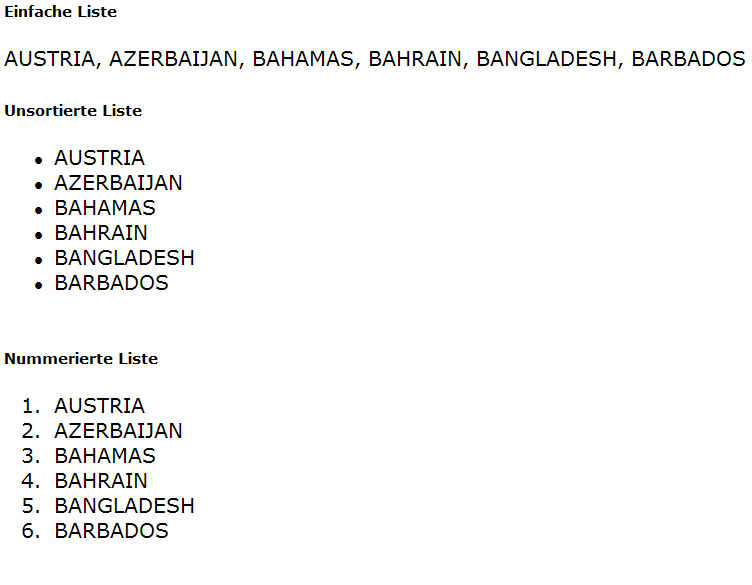
| layout | String | Yes | simple|unorderedList|orderedList
|
| onclick | String | Yes | HTML: Script to be invoked when the element is clicked. |
| ondblclick | String | Yes | HTML: Script to be invoked when the element is double-clicked. |
| onkeydown | String | Yes | HTML: Script to be invoked when a key is pressed down over this element. |
| onkeypress | String | Yes | HTML: Script to be invoked when a key is pressed over this element. |
| onkeyup | String | Yes | HTML: Script to be invoked when a key is released over this element. |
| onmousedown | String | Yes | HTML: Script to be invoked when the pointing device is pressed over this element. |
| onmousemove | String | Yes | HTML: Script to be invoked when the pointing device is moved while it is in this element. |
| onmouseout | String | Yes | HTML: Script to be invoked when the pointing device is moves out of this element. |
| onmouseover | String | Yes | HTML: Script to be invoked when the pointing device is moved into this element. |
| onmouseup | String | Yes | HTML: Script to be invoked when the pointing device is released over this element. |
| preserveRowStates | boolean | Yes | Indicates whether the state for each row should not be discarded before the datatable is rendered again. Setting this to true might be hepful if an input component inside the datatable has no valuebinding and the value entered in there should be displayed again. This will only work reliable if the datamodel of the datatable did not change either by sorting, removing or adding rows. Default: false |
| rendered | boolean | Yes | A boolean value that indicates whether this component should be rendered. Default value: true. |
| rowClasses | String | Yes | A comma separated list of CSS class names to apply to td elements in each row. |
| rowCountVar | String | Yes | A parameter name, under which the rowCount is set in request scope similar to the var parameter. |
| rowIndexVar | String | Yes | A parameter name, under which the current rowIndex is set in request scope similar to the var parameter. |
| rowKey | Object | Yes | Used to assign a value expression that identify in a unique way a row. This value will be used later instead of rowIndex as a key to be appended to the container client id using getDerivedSubClientId() method. |
| rows | int | Yes | The number of rows to be displayed. Specify zero for all remaining rows in the table. |
| rules | String | Yes | HTML: Controls how rules are rendered between cells. Values include: none, groups, rows, cols, and all. |
| style | String | Yes | HTML: CSS styling instructions. |
| styleClass | String | Yes | The CSS class for this element. Corresponds to the HTML 'class' attribute. |
| summary | String | Yes | HTML: Provides a summary of the contents of the table, for accessibility purposes. |
| title | String | Yes | HTML: An advisory title for this element. Often used by the user agent as a tooltip. |
| value | Object | Yes | An EL expression that specifies the data model that backs this table. The value can be of any type. A value of type DataModel is used directly. Array-like parameters of type java.util.List, array of Object, java.sql.ResultSet, or javax.servlet.jsp.jstl.sql.Result are wrapped in a DataModel. Other values are wrapped in a DataModel as a single row. |
| var | String | No | Defines the name of the request-scope variable that will hold the current row during iteration. This value must be a static value. |
| visibleOnUserRole | String | Yes | If user is in given role, this component will be rendered normally. If not, nothing is rendered and the body of this tag will be skipped. |
| width | String | Yes | HTML: Specifies the desired width of the table, as a pixel length or a percentage of available space. |