While this section provides an overview how Controls work please see the Javadoc, which provides extensive information and examples.
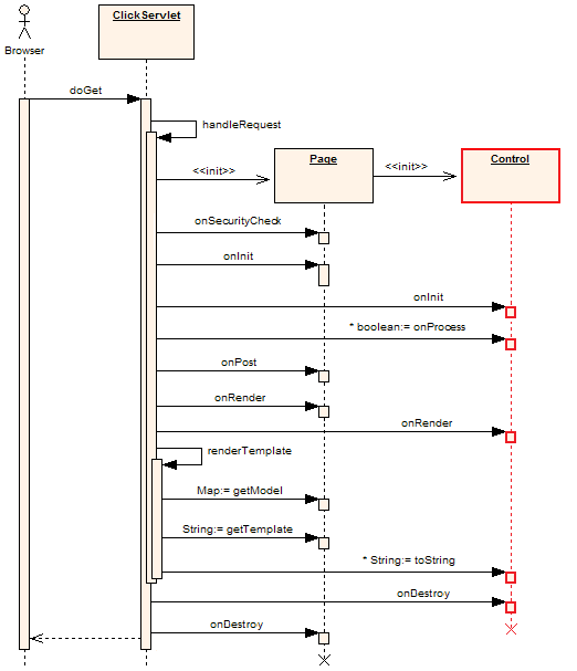
Figure 1. Post Sequence Diagram - created with Enterprise Architect courtesy Sparx Systems
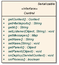
In Click all control classes must implement the Control interface. The Control interface is depicted below in Figure 2.
Figure 2. Control Interface Diagram - created with Enterprise Architect courtesy Sparx Systems
Methods on the Control interface include:public class SimpleCallback extends Page { public SimpleCallback() { ActionLink clickLink = new ActionLink("clickLink"); // Set the link's listener to callback this page's onClick method. clickLink.setListener(this, "onClick"); addControl(clickLink); } public boolean onClick() { System.out.println("onClick invoked"); return true; } }The listener method can have any name but it must have take no parameters and must return a boolean or java.lang.Boolean value. When a callback method returns true the processing of other Controls will continue and the Pages onGet() or onPost() event handler will be called. If a callback method returns false no further Control processing will be performed and neither of the Page onGet() or onPost() methods will be invoked. This execution logic is illustrated in the Page Execution Activity Diagram. Being able to stop further processing and do something else can be very handy. For example your Pages onGet() or onPost() method may perform an expensive database operation. By returning false in an event handler you can skip this step and render the template or forward to the next page.
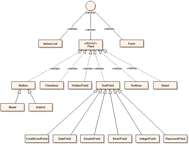
Figure 3. Package Class Diagram - created with Enterprise Architect courtesy Sparx Systems
The key control classes include:/com/mycorp/page/Login.propertiesIf you want to tailor messages for a particular page this is where to place them.
/click-page.propertiesIf you want messages to be used across your entire application this is where to place them.
/com/mycorp/control/CustomTextField.properties
/click-control.properties
# Click Control messages
field-maxlength-error={0} must be no longer than {1} characers
field-minlength-error={0} must be at least {1} characters
field-required-error=You must enter a value for {0}
file-required-error=You must enter a filename for {0}
label-required-prefix=
label-required-suffix=<span class="required">*</span>
label-not-required-prefix=
label-not-required-suffix=
not-checked-error=You must select {0}
number-maxvalue-error={0} must not be larger than {1}
number-minvalue-error={0} must not be smaller than {1}
select-error=You must select a value for {0}
table-first-label=First
table-first-title=Go to first page
table-previous-label=Prev
table-previous-title=Go to previous page
table-next-label=Next
table-next-title=Go to next page
table-last-label=Last
table-last-title=Go to last page
table-goto-title=Go to page
table-page-banner=<span class="pagebanner">{0} items found, displaying {1} to {2}.</span>
table-page-banner-nolinks=
<span class="pagebanner-nolinks">{0} items found, displaying {1} to {2}.</span>
table-page-links=<span class="pagelinks">[{0}/{1}] {2} [{3}/{4}]</span>
table-page-links-nobanner=<span class="pagelinks-nobanner">[{0}/{1}] {2} [{3}/{4}]</span>
# Message displayed when a error occurs when the application is in "production" mode
production-error-message=
<div id='errorReport' class='errorReport'>The application encountered an unexpected error.
</div>
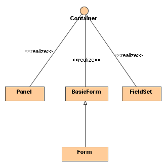
Figure 4. Containers Class Diagram
The following convenient classes is available to work with and create custom Containers: Lets cover each of them here. AbstractContainer Enables easy creation of custom Containers for example a html div or span element. For example:
public class Div extends AbstractContainer {

    public Div(String name) {
        super(name);
    }

    public String getTag() {
        // Return the control's HTML tag.
        return "div";
    }
}
Lets test the Div: (note the MockContext used in this test is described in the
Mock Test Support documentation)
public class Test {
    public static void main (String args[]) {
        // Create mock context in which to test the container.
        MockContext.initContext();

        // Create a div instance called "mydiv"
        String containerName = "mydiv";
        Div mydiv = new Div(containerName);

        // Add a control to the container
        mydiv.add(new TextField("myfield"));

        System.out.println(mydiv);
    }
}
Executing the above example results in the following output:
<div name="mydiv" id="mydiv">
    <input type="text" name="myfield" id="myfield" value="" size="20" />
</div>
public class FieldContainer extends AbstractContainerField {

    public FieldContainer(String name) {
        super(name);
    }

    // Return the html tag to render
    public String getTag() {
        return "div";
    }
}
FieldContainer can safely be used with Form, since FieldContainer is a field.
Please note that FieldContainer is just a normal container and any control can be added
to it including tables, trees and panels. This circumvents the restriction placed on Form
which can only accept fields as children. Its up to you to decide whether its a good idea
to add non-field controls inside a Form. Normally it would be better to resort to BasicForm
for these situations as you will have full control over the form layout.
To test the new class we use the following snippet:
public class Test {
    public static void main (String args[]) {
        // Create mock context in which to test the container.
        MockContext.initContext();

        // Create a FieldContainer instance called "field_container"
        String containerName = "field_container";
        FieldContainer fieldContainer = new FieldContainer(containerName);

        // Add a couple of fields to the container
        fieldContainer.add(new TextField("myfield"));
        fieldContainer.add(new TextArea("myarea"));

        System.out.println(fieldContainer);
    }
}
Executing the snippet produces the output:
<div name="field_container" id="field_container">
    <input type="text" name="myfield" id="myfield" value="" size="20"/>
    <textarea name="myarea" id="myarea" rows="3" cols="20"></textarea>
</div>
//EmployeePage.java
public EmployeePage extends Page {

    private Form form;

    public void onInit() {
        // Create form
        Form form = new Form("form");

        // Add a couple of fields to the form
        form.add(new TextField("firstname"));
        form.add(new TextField("lastname"));
        form.add(new IntegerField("age"));
        form.add(new DoubleField("salary"));

        // Add a submit button to form
        form.add(new Submit("submit", "Add Employee"));

        // Add form the page
        addControl(form);
    }
}
Lets imagine we want to use a CSS layout using Div <div> and html List <ol> tags.
We could provide the markup for the employee.htm template as shown below,
using a template engine like Velocity:
<!--employee.htm-->
${form.startTag()}
    <div style="margin: 1em;">
        <ol>
            <li>
                <label for="firstname">Firstname:</label>
                ${form.fields.firstname}
            </li>
            <li>
                <label for="lastname">Lastname:</label>
                ${form.fields.lastname}
            </li>
            <li>
                <label for="age">Age:</label>
                ${form.fields.age}
            </li>
            <li>
                <label for="salary">Salary:</label>
                ${form.fields.salary}
            </li>
        </ol>
    </div>
    ${form.fields.submit}
${form.endTag()}
Using a CSS stylesheet, this markup can be transformed into a great looking form as shown
in this article.
There are pros and cons to using the template layout approach.
One of the advantages of the Template layout, is that the layout is explicit and one can easily
change it to something else. For example instead of using divs and ordered lists, one can
change the template to leverage a table layout.
A disadvantage of the Template layout is it introduces redundancy.
In the example above you needed to create the fields in Java, and lay them out using html markup
in the template.
If the requirements change to add a new field for example, one will have to add the
field in the Page as well as the template. Of course it is possible to "generify"
the layout using template engines like Velocity, Freemarker or JSP, since they provide
constructs such as iterators and conditional logic. Macro.vm
is an example of a generic form layout using Velocity.
Container layouts
To combat the redundency instroduced by the Template approach, you can use Containers
for layout purposes.
By using containers, the form and fields could be created and laid out in Java.
Containers such as Div, Span, List, HorizontalPanel and VerticalPanel are ideal for layouts.
Click does not yet provide these containers out of the box, but we can put some together as
shown below:
// Div.java
// Create a html <div> element
public class Div extends AbstractContainer {

    public String getTag() {
        return "div";
    }
}
// HtmlList.java
// Create a list <ol> html element, that accepts <li> elements as children
public class HtmlList extends AbstractContainer {

    public String getTag() {
        return "ol";
    }

    // Can only add ListItems: <li> tags
    public Control add(Control control) {
        if (!(control instanceof ListItem)) {
            throw new IllegalArgumentException("Only list items can be added.");
        }
        return super.add(control);
    }
}
// ListItem.java
// Create a listItem <li> element
public class ListItem extends AbstractContainer {

    public String getTag() {
        return "li";
    }
}
After creating all the needed containers the form can be assembled.
Continuing with the employee example from the template layout
section, the form can be created as follows (note BasicForm is used instead of Form):
// EmployeePage.java
public class EmployeePage extends BasicForm {
    // A form instance variable
    private BasicForm form;

    // Build the form when the page is initialized
    public void onInit() {
        // Create a BasicForm for manual layout
        form = new BasicForm("form");

        // Create a list and add it to the form.
        HtmlList list = new HtmlList();
        form.add(list);

        // Add firstname field and pass in its name, label and the list to add the field to
        addTextField("firstname", "Firstname:", list);
        addTextField("lastname", "Lastname:", list);
        addTextField("age", "Age:", list);
        addTextField("salary", "Salary:", list);

        // Add a submit button to form
        form.add(new Submit("submit", "Add Employee"));

        // Add the form to the page
        addControl(form);
    }

    // Provide a helper method to add fields to the form
    private void addTextField(String nameStr, String labelStr, List list) {
        // Create a new ListItem <li> and add it to the List
        ListItem item = new ListItem();
        list.add(item);

        // Create a textfield with the specified name
        Field field = new TextField(nameStr);

        // Create a field label, which associates the label with the field id.
        // label.toString would output: <label for="firstname">Firstname:</name>
        FieldLabel label = new FieldLabel(field, labelStr);

        // Add the label and field to the list item.
        // item.toString would then produce:
        // <li>
        //   <label for="firstname">Firstname:</name>
        //   <input type="text" name="firstname" id="form_firstname" value="" size="20"/>
        // </li>
        //
        item.add(label);
        item.add(field);
    }
}
Now the employee.htm template would only need to specify the name of the
top level container, in this case form.
<!--employee.htm-->
${form}
which produces the following markup:
<!--employee.htm-->
<form method="post" id="form" action="/myapp/employee.htm">
<input type="hidden" name="form_name" id="form_form_name" value="form"/>
    <div style="margin: 1em;">
        <ol>
            <li>
                <label for="firstname">Firstname:</label>
                <input type="text" name="firstname" id="form_firstname" value="" size="20"/>
            </li>
            <li>
                <label for="lastname">Lastname:</label>
                <input type="text" name="lastname" id="form_lastname" value="" size="20"/>
            </li>
            <li>
                <label for="age">Age:</label>
                <input type="text" name="age" id="form_age" value="" size="20"/>
            </li>
            <li>
                <label for="salary">Salary:</label>
                <input type="text" name="salary" id="form_salary" value="" size="20"/>
            </li>
        </ol>
    </div>
    <input type="submit" name="submit" id="form_submit" value="Add Employee"/>
</form>
Again using a CSS stylesheet, the markup above can be transformed into a great looking form as shown
in this article.
You can see a live demo
of the above example. Note that the demo adds a couple of features, including error reporting,
not covered here.
The advantage of the container approach is that there is no redundancy. Each field is
created and added to its container in Java. If new fields are added they will be added
to their container in the page. No need to change the template as the layout is taken
care of by a combination of markup produced by the container and CSS stylesheets.
A disadvantage is that it is harder to see what output would be rendered by the containers.
Whether you use the template or container
layout approach, is up to you. Both work well and have advantages and disadvantages
over the other.